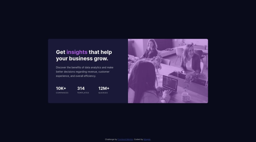
Design comparison
Solution retrospective
There are two questions I would like to ask while completing this challenge:
-
Flex box was used for putting the footer in the bottom. I created a body::before and uses space-between to centralize the card and place footer in the bottom. It worked well in desktop version, but in mobile version, the card shrink into the size that could not hold all the content. I finally hard coded the height of the card to solve the problem. Are there ways to auto expand the height of the card?
-
I used two div to add color filter to header image.
html: <header class="image"> <div class="layer"> </div> </header>
css:
  header{
        flex: 0 0 auto ;
        width: 50%;
        background-image:url("./images/image-header-desktop.jpg");
        background-size: cover;
        background-position: center center;
        position: relative;

        .layer{
            width: 100%;
            height: 100%;
            background-color: $soft_violet;
            opacity: 50%;
        }
    }
But the color looks so different due to the change of opacity, are there any ways to deal with changing the background image color?
Thank you!! Any other feedback are also welcomed!
Community feedback
Please log in to post a comment
Log in with GitHubJoin our Discord community
Join thousands of Frontend Mentor community members taking the challenges, sharing resources, helping each other, and chatting about all things front-end!
Join our Discord
