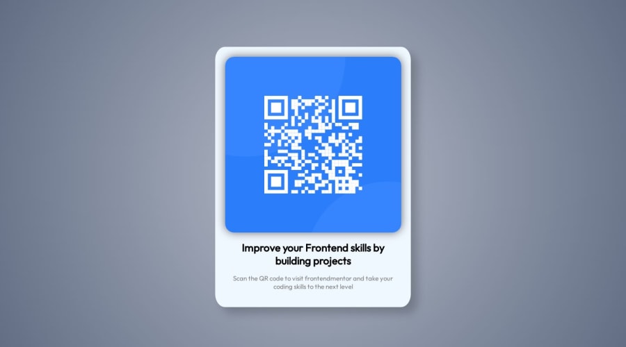
Design comparison
Solution retrospective
my first project in html + css. Not so difficult, but i could improve responsive desgin next time
Community feedback
- @Bibiwei-PerePosted over 1 year ago
Hi
Congratulations on completing this challenge
Firstly, use min-height instead of height. Using height makes your solution not scrollable on smaller screens. Also the appropriate background color for the body tag is given below
.body {
min-height: 100vh;
background-color: hsl(212, 45%, 89%);
}
Lastly, remove
box-shadowfrom.tilebecause it's not necessary for this challengeOverall, you did a great job 👍
Hope you find this helpful
0@mrintoxxPosted over 1 year ago@Bibiwei-Pere Thanks for your comments, I've read what you say about min-height, I'm using it now. For the box shadow and background color, those were just design variations, I wasn't trying to replicate the visual exactly.
0
Please log in to post a comment
Log in with GitHubJoin our Discord community
Join thousands of Frontend Mentor community members taking the challenges, sharing resources, helping each other, and chatting about all things front-end!
Join our Discord
