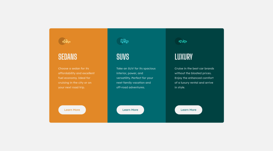
Design comparison
Solution retrospective
Hey! I am Reza 🙂 I just recently started to learn web-development and would like to get every little help out there. So if you have the time, feel free to look over my project/projects and give me some advice to get better as fast as possible.
Project #7: Some questions for this "Triple-Column" project:
- Did I center everything right, or was there a easier way?
- Was there a easier way to design some things in way less code?
- What did I do completely wrong, and just have luck within this project?
- What would you do different?
I appreciate it✌️
Community feedback
- @Victor-NyagudiPosted almost 2 years ago
Hello, Reza.
Good effort on this one.
Number 1. I believe you centered the three cards on the page correctly. There are other ways, but yours works just fine. However, for the content inside each card, you used a mix of margin and padding, which works, but can break easily.
If you wanted to increase/decrease the space around all the items, you'd have to manually change them for the heading, image, text, etc.
I'd recommend turning each card into a flexbox container and using
align-items: center;andjustify-content: center;.Here's an example of how the code would look.
.left {
   display: flex;
   flex-direction: column;
   align-items: center;
   justify-content: center;
   padding: 2em; // <- This padding is applied to the container, so this is the only place you'll need to change the padding for it to affect all elements inside it
}
Number 2. This is a fairly simple solution of just HTML and CSS, so I don't see much you can do to use less code.
Number 3. You used a
<p>tag for headings instead of an<h2>for each card, but you've been told this already in the previous comment.Number 4. I'd make the changes mentioned above and use more descriptive class names for the cards e.g.
.left-cardor.sedan-cardinstead of just.leftwhich is ambiguous.I hope this helps.
All the best with future solutions.
Marked as helpful0@rezajaberPosted almost 2 years ago@Victor-Nyagudi hey vicktor, thank you for such a detailed and perfectly explained feedback, everything you mentioned makes perfectly sense and I will do my best to adapt these changes :)
Have a great day and happy coding!
1 - @VCaramesPosted almost 2 years ago
Hey there! 👋 Here are some suggestions to help improve your code:
- Along with the blank
alt tag, you also want to include thearia-hidden=“true”to your “car images/icons” to fully remove them from assistive technology.
More Info:📚
https://www.w3.org/WAI/tutorials/images/
- The “SEDANS”, “SUVS” and “LUXURY” are headings so they need be wrapped in a heading element. Since each heading in this card has the same level of importance an
Hh2heading will be the best choice.
- Your "buttons" were created with the incorrect element. When the user clicks on the button they should be directed to a different part of you site. The
anchor tagwill achieve this.
More Info:📚
If you have any questions or need further clarification, feel free to reach out to me.
Happy Coding!🎄🎁
Marked as helpful0@rezajaberPosted almost 2 years ago@vcarames hey バレンタイン 😈 :) I did not know about the aria-hidden="true" code, so thank you for that one :=) And thanks a lot for putting the effort of giving me the right links to learn from, this is a big help :)
I really appreciate it and wish you a great day :)
0@VCaramesPosted almost 2 years ago@rezajaber
I am glad that I was able to help out!
Keep it up!
0 - Along with the blank
Please log in to post a comment
Log in with GitHubJoin our Discord community
Join thousands of Frontend Mentor community members taking the challenges, sharing resources, helping each other, and chatting about all things front-end!
Join our Discord
