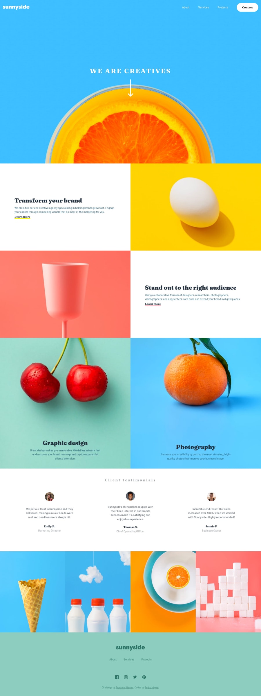
Submitted about 3 years ago
tried to used BEM, gave up, started again. ToT
@pedromigueldev
Design comparison
SolutionDesign
Solution retrospective
Any tips and cunstructive opinions are wellcome :D. I used BEM half of the project, it's somethin' hard to get the head around °~°.
Community feedback
- @ChamuMutezvaPosted about 3 years ago
- let your alt values to benefit assistive technology users to visualize the message that is being put across.
<img class="logo"src="./images/logo.svg" alt="Sunnyside">
. A screen reader shouting sunnyside does not give enough information. - use semantic elements always, the following div won't be accessible to assistive tech users, you need to code more to make it work
<div class="hamburguer"> <div class="linha"></div> <div class="linha"></div> <div class="linha"></div> </div
- the only permitted direct child of a
ul
is anli
element. The last item below is needing attention
<ul> <li><a class="links" href="#">About</a> </li> <li><a class="links" href="#">Services</a></li> <li><a class="links" href="#">Projects</a></li> <a class="links botao" href="#">Contact</a> // missing an li element </ul>
- this can't be anchor element
<a class="titulo">We are creatives</a>
- a heading element for me. - use unordered list for navigation, it is beneficial to assistive technology users
<div class="rodape__links"> <a href="#" class="rodape__link">About</a> <a href="#" class="rodape__link">Services</a> <a href="#" class="rodape__link">Projects</a> </div>
- avoid over nesting your css
.navbar .navbar-linksMobile ul li { height: 2.1875rem; }
Marked as helpful2 - let your alt values to benefit assistive technology users to visualize the message that is being put across.
Please log in to post a comment
Log in with GitHubJoin our Discord community
Join thousands of Frontend Mentor community members taking the challenges, sharing resources, helping each other, and chatting about all things front-end!
Join our Discord