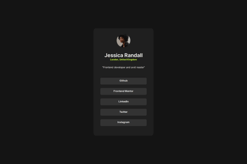
Submitted over 1 year agoA solution to the Social links profile challenge
Tried to make different parts from flex and grid
@sidr467

Solution retrospective
What are you most proud of, and what would you do differently next time?
Responsive
What challenges did you encounter, and how did you overcome them?It was perfect in desktop but for mobile Card size was bigger. But after changing some width and stuff i made it.
What specific areas of your project would you like help with?CSS
Code
Loading...
Please log in to post a comment
Log in with GitHubCommunity feedback
No feedback yet. Be the first to give feedback on sidr467's solution.
Join our Discord community
Join thousands of Frontend Mentor community members taking the challenges, sharing resources, helping each other, and chatting about all things front-end!
Join our Discord