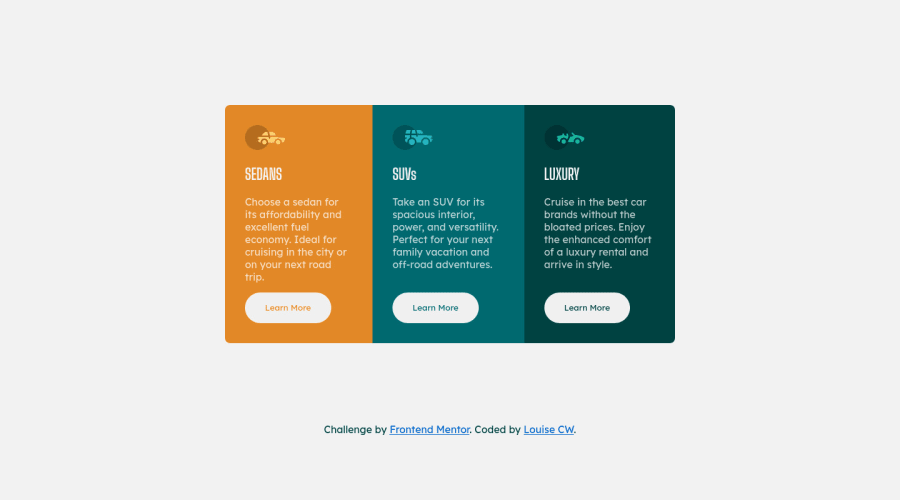
Design comparison
Solution retrospective
Tried out CSS variables, a really fun challenge. I wonder if there is a way to style the buttons using less lines of code? Any feedback or comments appreciated.
Community feedback
- @ApplePieGiraffePosted over 3 years ago
Hi there, LouiseCW! 👋
Well done on this challenge! 👍 Your solution looks good and is responsive! 😀
One tiny thing I'd like to suggest is that you perhaps use the a heading tag of the same level for all three headings in the card component (since one doesn't seem to be of any more importance than another in this design). 😉
As for styling the buttons, you can simply make set their background-color to
transparent
when they are hovered over so that the background of each section shows through them and you don't have to mess around with adding individual background-colors to each button upon hover:button:hover { background-color: transparent; }
Hope that is helpful. 🙂
Keep coding (and happy coding, too)! 😁
Marked as helpful0@costelloewardPosted over 3 years ago@ApplePieGiraffe Hello APG! 👋 Thanks very much, I'm glad you found it responsive.
That's a great point about transparent, I completely forget it can apply to buttons! Cheers 🙂
I started with h2 tags for all the headers and then the accessibility report flagged that there was no h1 tag. I've seen that multiple h1 tags is not best practice, but in this specific design would that be the best option?
1@ApplePieGiraffePosted over 3 years ago@costelloeward
Glad to help! 😀
That's actually a good point about the
<h1>
tag (I forgot that the accessibility reporter flags that issue). However, some people have opinions that using multiple<h1>
tags is okay and even encouraged in some cases! For now, I might still go with<h2>
tags for all of the headings in this card just because it's more of a component that is likely to be used in a webpage (rather than just stand alone by itself, as in this challenge), and that webpage could probably have an<h1>
somewhere else. Just a thought, I guess. 🙂1@ApplePieGiraffePosted over 3 years ago@costelloeward
Pro tip: the accessibility reporter won't automatically check your solution again when you update it, so you can still change the headings if you want, and as long as you don't hit "Generate New Report", your solution report should remain nice and clear. 😆
0@costelloewardPosted over 3 years ago@ApplePieGiraffe Thanks, this is really helpful to think about the overall context a design might be placed in.
Cheers! 🙂
1 - @Blazing-MikePosted over 3 years ago
Louise great job you did 👏👏... I think your code is fine that way unless you want to use shorthand value in CSS. There's also a concept of seperating skin ( color and appearance) from structure ( border, border radius, width, height) so all buttons on that page have same structure but different skin so you you give them two classes one to style their structure and the other classes to give their skin styling and I read your code and you did something like that so it's totally fine 🌝
Marked as helpful0
Please log in to post a comment
Log in with GitHubJoin our Discord community
Join thousands of Frontend Mentor community members taking the challenges, sharing resources, helping each other, and chatting about all things front-end!
Join our Discord