Design comparison
SolutionDesign
Solution retrospective
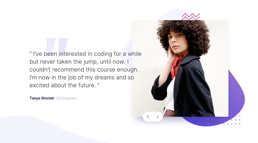
I struggled again with the position of the background objects as well as adjusting the breakpoints to make the mobile version look good. I think it has come out alright in the end.
Community feedback
Please log in to post a comment
Log in with GitHubJoin our Discord community
Join thousands of Frontend Mentor community members taking the challenges, sharing resources, helping each other, and chatting about all things front-end!
Join our Discord
