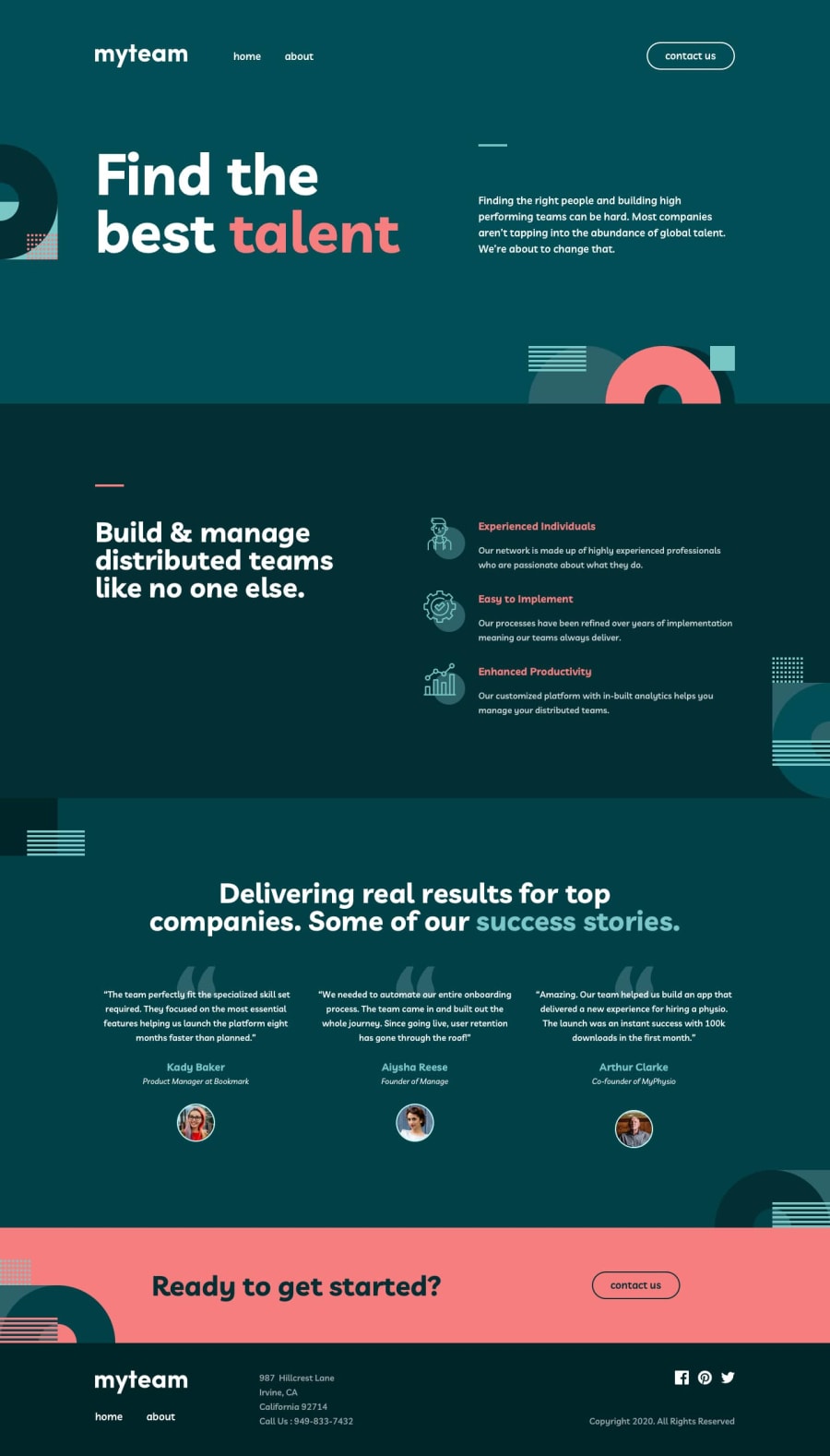
Design comparison
Solution retrospective
I would like some comments + opinions on if my JS is understandable (I tried to put notes to make it more readable).
Thank you!
Community feedback
- @adarshcodesPosted over 4 years ago
Hi! @Diarrah, Great work on this challenge👍.
- Design: your design looks great and everything is working fine.
- Responsiveness: Your responsive codes are also working properly.
- Code: I'm just started learning JS, so can't understand the whole code at this moment. But some of the things seem familiar to me. It's clean and well commented. Happy Coding🙂
4 - @mattstuddertPosted over 4 years ago
Hey Diarrah, I've just had a closer look at your HTML and there are actually a few recommendations that I've got:
- You've defined the "Finding the right people..." content in the intro as a
h4. I would say this is a paragraph of text. It's not really a heading for anything. So apwould make more sense. - Why have you added
brtags under each of theh3headings in the "Build & manage distributed teams..." section? If it's to add spacing I'd recommend just usingmargininstead. - For the testimonials on the homepage and the team images on the about page, you've added
alttext for the avatar pictures saying things like "Woman stock photo" or "Man stock photo". I'd recommend being less vague with these and a bit more descriptive to provide more context for screen reader users. Something like "Aiysha Reese avatar photo" would add more context. - For the address in the
footerI'd recommend using theaddresselement with aulfor the street, city, etc. Here's more information on the address element from MDN.
I hope these pointers help. As I mentioned before, you've done a really good job on this challenge! 👍
2@DiarrahPosted over 4 years ago@mattstuddert Thank you for this feedback! May I ask, though, why is it bad to use <br> tags?
0@annetawamonoPosted over 4 years ago@Diarrah I might be incorrect on this, but I think it's better to use margins for spacing because it gives you more control across different browsers. The
brtag may be rendered differently on different browsers.2@mattstuddertPosted over 4 years ago@Diarrah @annetawamono has hit the nail on the head with this.
marginis a much more accurate way to space out elements and doesn't add any unnecessary HTML.0 - You've defined the "Finding the right people..." content in the intro as a
- @mattstuddertPosted over 4 years ago
Hey Diarrah, you've done an awesome job on this challenge. Everything looks amazing and works as per the brief. Your JS works well too and is well written and commented.
Great work! 🙌
2
Please log in to post a comment
Log in with GitHubJoin our Discord community
Join thousands of Frontend Mentor community members taking the challenges, sharing resources, helping each other, and chatting about all things front-end!
Join our Discord
