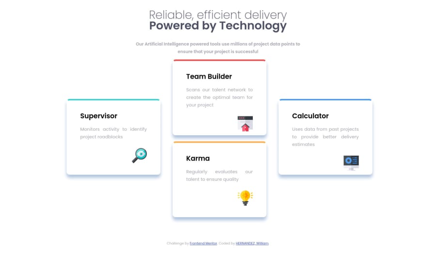
Design comparison
Solution retrospective
Thank you for taking the time to review my code. Even though it is not 100% accurate to the design preview(mobile & desktop), I feel enthusiastic about this one because I understand coding much better than when I first started. I can see my progress with each of these projects. So please, do not hesitate to give me ANY kind of feedback. It will greatly be appreciated. I will use any & all advice to keep ameliorating my skills. Thank you again for checking out my code, I look forward to your feedback!
Community feedback
- @palgrammingPosted over 3 years ago
well at 840px wide you can see that your cards are overflowing the left and right side of the browser window so you need to work on your transition from mobile to desktop
0 - Account deleted
Well Done ✌ But You can edit the margin-bottom of the first header and check the box-shadow and make it lighter you can check the width of the boxes and make to larger..
0
Please log in to post a comment
Log in with GitHubJoin our Discord community
Join thousands of Frontend Mentor community members taking the challenges, sharing resources, helping each other, and chatting about all things front-end!
Join our Discord
