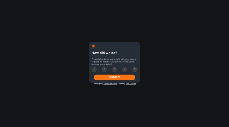
@traez's Interactive rating component solution, using JavaScript et al
Design comparison
Solution retrospective
What I learned
- Continuos improvement in CSS Competency
- Manipulating the DOM practically to add JavaScript color to webpage
Continued development
- Read up and practice on DOM Event Listener methods in JavaScript
This is just the start of great JavaScript Magic!
Community feedback
- @hyrongennikePosted about 2 years ago
Hi @traez,
Congrats on completing the challenge
I would suggest just disable the button until a rating is selected this can be done by adding the disabled attribute on the button and removing it when the rating is clicked. Currently the when you click the button without selecting a value it's empty.
Hope this is helpful.
Marked as helpful0@traezPosted about 2 years ago@hyrongennike You're very correct. Well noted. And will take heed going forward. Thanks!
0 - @correlucasPosted about 2 years ago
👾Hello Trae Zeeofor, Congratulations on completing this challenge!
Great solution and a great start! From what I saw you’re on the right track. I’ve few suggestions for you that you can consider adding to your code:
1.To improve the card overall responsibility, you can start to add
flex-wrapinside the class that manages the section for therating numbers buttonand makes the adjust to fit in different rows while the container scales down, not that without this property the container doesn't shrink.2.To reduce your CSS file and improve the performance of loading your page you can use a tool called
CSS minifythat reduces the CSS code by removing the unnecessary characters. You can use aVSCodeplugin calledminify cssor this website tool to reduce your code:https://www.toptal.com/developers/cssminifier✌️ I hope this helps you and happy coding!
0
Please log in to post a comment
Log in with GitHubJoin our Discord community
Join thousands of Frontend Mentor community members taking the challenges, sharing resources, helping each other, and chatting about all things front-end!
Join our Discord
