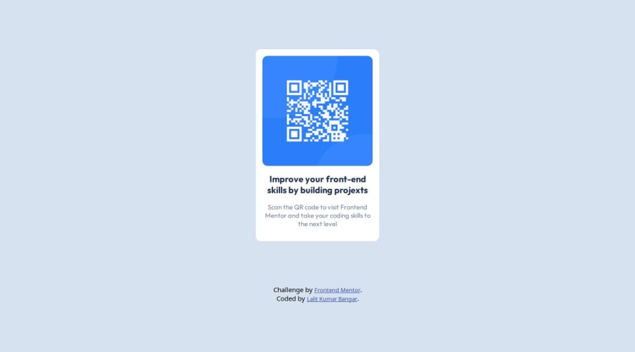
Design comparison
Solution retrospective
What did you find difficult while building the project? The difficult part was to add padding and margin pixels to make the design similar to the given design images. It would have been much easier if those instructions were also given in the ReadMe.md file.
Which areas of your code are you unsure of? I doubt the media query that I used, as I used flex-box which inherits responsive behaviour, but I have a few doubts regarding the responsiveness.
Community feedback
- @CalebWhorton12Posted 10 months ago
Congratulations on completing the QR code project!
My only suggestions for improvement would be to make use of Semantic HTML by adding tags such as <main> and <footer> to improve the structure and accessibility of your code.
External CSS: Moving your styles into a CSS file instead of the head. This helps your code read cleaner and easier to maintain.
Despite these few improvements your solution works very well and it's clear you put a lot of effort into it!
Keep up the great work!
Marked as helpful0 - @CaaspitaPosted 10 months ago
The page looks very good, but I have some suggestions for you.
-It would be good to separate the HTML and CSS code into different files to maintain order. While it may not be much, it is more organized.
-The <h2> tag could be used as <h1> since it is the main topic, helping the browser better understand the theme of your page and display it to the correct users.
-As Mark mentioned, the use of semantic HTML is a good practice as it helps the browser better understand your code.
Congratulations on completing this challenge! Best of luck, and keep improving.
0
Please log in to post a comment
Log in with GitHubJoin our Discord community
Join thousands of Frontend Mentor community members taking the challenges, sharing resources, helping each other, and chatting about all things front-end!
Join our Discord