toggle storage submit search html-inject css-inject
Design comparison
Solution retrospective
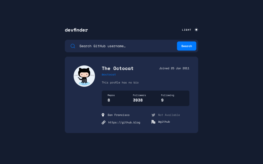
Well rounded activity with many quirks to iron out. Things that need work are the color structure, especially for theme change. Next time I will use embedded SVG instead of pointing to img/url for color changes, since filter property is not consistent enough. Next time will use attributes on html as this can simplifies JS.
Any comments or clarification welcomed.
Community feedback
- @vanzasetiaPosted about 2 years ago
Hi, Leopoldini! π
Good effort on this challenge! π
I notice an issue where the user's avatar doesn't get changed. So, I recommend trying to fix this issue.
One suggestion for JavaScript is to use
toUTCString()
to get the formatted value for the date. You can use a regular expression to get the part of the string that you need. I found this approach required less code to write. So, you may want to give it a try."A Theme Switcher | Inclusive Components" and "Toggle Buttons | Inclusive Components" articles are helping me to create accessible theme switcher. I would recommend you to read those two awesome articles.
That's it! I hope you find this useful!
Marked as helpful1@vanzasetiaPosted about 2 years ago@LShiznit
One important thing that I just notice is to use
button
element instead ofinput
button.input
withtype="button"
was used before thebutton
element exist. It's best to avoid using legacy elements. So, I recommend usingbutton
element instead.Also, it should be a submit button. So, make sure you write the correct type for the button.
Marked as helpful1@LShiznitPosted about 2 years ago@vanzasetia This is great advice. toUTCSring() button element as better practice
Thanks for the articles. I will have to follow you =P Cheers
1 - @tesla-ambassadorPosted over 2 years ago
Hey Poldini, pretty solid solution... It's really awesome! I think use of embedded SVGs is a great idea too! Just to solve your accessibility issues, you might want to use your heading tags in logical order. In your case, instead of using the <h3>, you might want to use the <h2> and instead of the <h4>, use the <h3>. It enables the browser to properly navigate your website. Your solution's responsiveness is really good too! Happy coding!
1
Please log in to post a comment
Log in with GitHubJoin our Discord community
Join thousands of Frontend Mentor community members taking the challenges, sharing resources, helping each other, and chatting about all things front-end!
Join our Discord