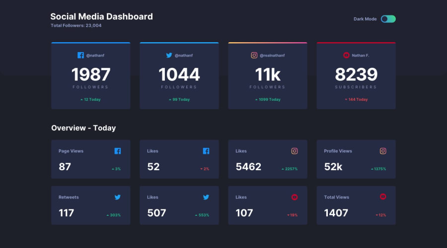
Toggle between Light & Dark using the power of React hooks
Design comparison
Solution retrospective
There are a still few known issues in spite of my best efforts. Any help in offering solution(s) would be greatly appreciated.
- The instagram top border shows up as white/black instead of the linear gradient of yellow to red.
- The Cards are not showing border-radius on bottom, as the radius-top needs to be shown separately for each card.
- All the 12 cards are not responsive to the extent required. As a workaround, the top 4 cards are rendered with overflow as 'auto'
- The background color for the top 4 cards could not be implemented as per design. Even though, I tried to add a dummy row to the header, the background color is not extending to this dummy row for some reason.
- The trends for the last 8 cards are showing up on the bottom LHS in Chrome. In Firefox, it shows as per design. I am not sure why.
Community feedback
- @rfilenkoPosted over 4 years ago
Hey, good job, but there are a lot of issues here. Check my solution (four cards) - same principles you can apply here (layout with grid, boder-top, border-radius on cards). Google how to disable browsers default styles, also no need to apply .dark-theme class a bunch of times - one time on a body is enough and style according to it. Use classes, not id for styling. Hope this helps😉
Fix those first, Roman
0@venky4cPosted over 4 years ago@rfilenko Thanks a lot for your valuable feedback. I have noted the points. This was my first challenge. I hope to improve in my next projects. Thanks for your time.
1
Please log in to post a comment
Log in with GitHubJoin our Discord community
Join thousands of Frontend Mentor community members taking the challenges, sharing resources, helping each other, and chatting about all things front-end!
Join our Discord
