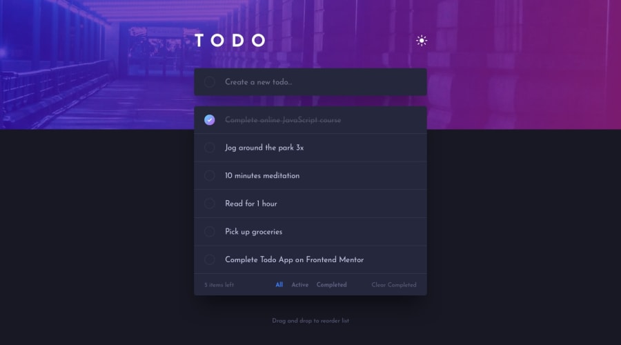
Design comparison
Solution retrospective
Hello guys,
Thanks for feedback on this todo-list user expérience :)
Community feedback
- Account deleted
Hi there 👋
Congratulate on finishing your project 🎉. You did a great job 🔨
I give some suggestions that I hope help you take your project design to the next level 📈.
- I can input whitespace and it's adding to the to-do list like 3 or 5 whitespaces, let's fix it in the functionality
- You can also add some transition while switching from dark to light mode 👍💡
Happy coding ☕
Maqsud
1@AllanguiPosted almost 3 years ago@maqsudtolipov Thanks a lot for the feedback i just updated the project right now ! Have a nice day :-)
1 - Account deleted
Hello there! 👋
Congratulations on finishing your challenge! 🎉
I have some feedback on this solution:
- Always Use Semantic HTML instead of
divlike<main><header>, etc for more info.
if my solution has helped you do not forget to mark this as helpful!
1@AllanguiPosted almost 3 years ago@Old1337 Of course i don't know why i did it with div ! It's update thank you mate !
1 - Always Use Semantic HTML instead of
Please log in to post a comment
Log in with GitHubJoin our Discord community
Join thousands of Frontend Mentor community members taking the challenges, sharing resources, helping each other, and chatting about all things front-end!
Join our Discord
