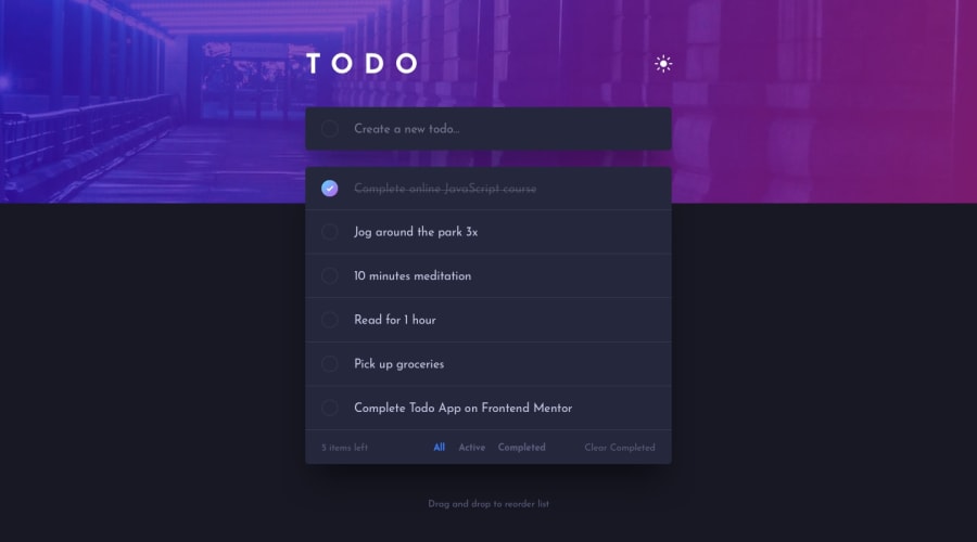
Design comparison
SolutionDesign
Solution retrospective
Doing this project has broadened my knowledge on proper styling, responsiveness and DOM manipulation, haha :)
Community feedback
- @dmroman395Posted almost 4 years ago
When you're typing to add a new item, the text color is black in dark mode which makes it very hard to see. Other than that it looks really good!
1@JoshAnabaPosted almost 4 years ago@dmroman395 thanks for this, i totally forgot to add it to my toggle items, i'll look into it
0
Please log in to post a comment
Log in with GitHubJoin our Discord community
Join thousands of Frontend Mentor community members taking the challenges, sharing resources, helping each other, and chatting about all things front-end!
Join our Discord
