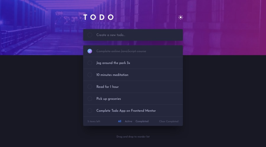
TodoAppMain with angular 17, cdk angular material, persistence, scss
Design comparison
Solution retrospective
Next time I would do it with an ID generator and not with an index, I think it's more scalable. I would also like someone to help me with an issue I'm having on mobile devices. The Android button appears as "Next" and I need it to always be "Go"; otherwise, it doesn't work correctly on mobile, as it only jumps from input to input like a normal form. Otherwise, I think it turned out well.
What challenges did you encounter, and how did you overcome them?There are a couple of things that make me feel unsatisfied. It would be easy if I just decided to put a button, but that would change the design. I decided to leave that issue as it is because I still need to learn a lot of important things, and maybe somebody here can help me more easily.
What specific areas of your project would you like help with?I would also like someone to help me with an issue I'm having on mobile devices. The Android button appears as "Next" and I need it to always be "Go".
Community feedback
- @KolahubPosted 8 months ago
This is really nice, how did you go about the drag and drop?
1@AndresFelipeForeroPosted 8 months ago@Kolahub Hello friend, I used Angular Material's CDK. The CDK allows you certain functionalities without needing to change the styles. DragAndDrogLink
0@KolahubPosted 8 months ago@AndresFelipeForero Just checked it, it's a really nice tool. Thank you
0@KolahubPosted 8 months ago@AndresFelipeForero Just checked it, it's a really nice tool. Thank you
0
Please log in to post a comment
Log in with GitHubJoin our Discord community
Join thousands of Frontend Mentor community members taking the challenges, sharing resources, helping each other, and chatting about all things front-end!
Join our Discord
