Design comparison
Community feedback
- @Pdave-dcnPosted 20 days ago
Hey! Nice work on completing this challenge, i actually did it myself a few months ago. You've done a solid job, but I think there’s some room for improvement, especially in the UI.
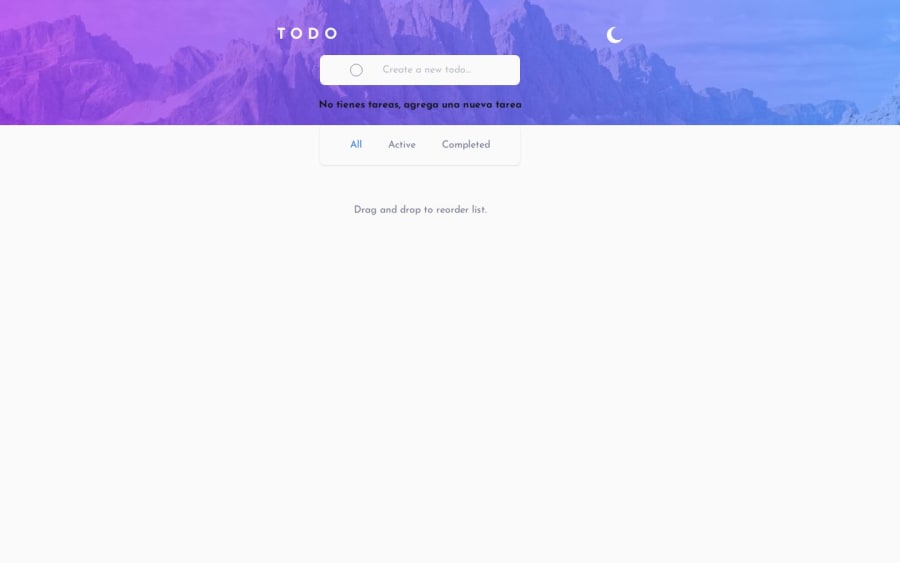
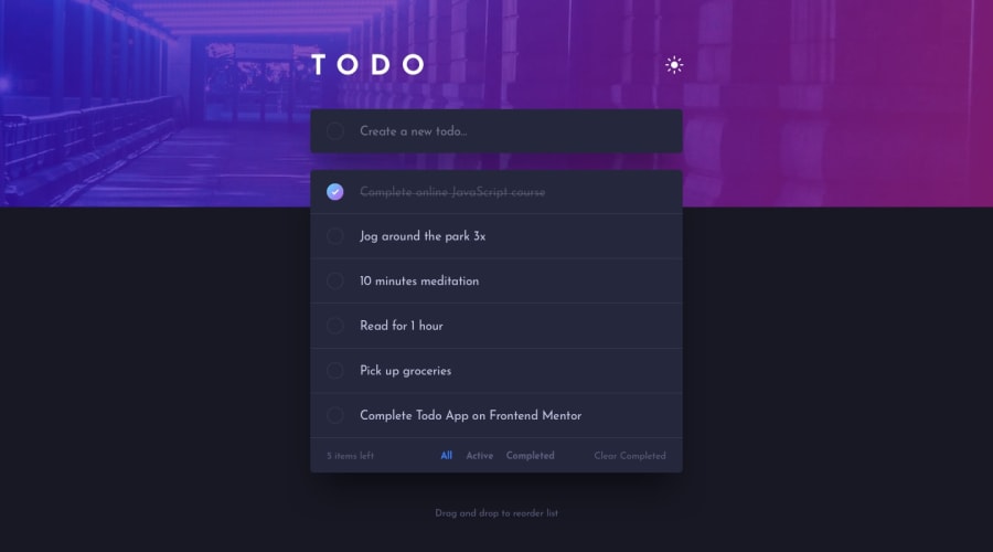
For example, on desktop, the todo (container) could be a bit larger for better readability. Also, centering the todo text looks a little off, it might feel more natural if it were left-aligned instead. Another thing: adding a new todo by pressing Enter would make the experience smoother, rather than relying solely on a button click.
I also took a look at your GitHub and checked out your useTodoHook. It’s well-structured, but it seems to be handling too many responsibilities at once. A cleaner approach would be to split concerns. One hook for managing the task list (CRUD operations), another for filtering logic, and maybe a final one to bring everything together (useTodoHook). This would make your code more maintainable, testable, and reusable.
Overall, you’re on the right track! Keep it up!
Marked as helpful1
Please log in to post a comment
Log in with GitHubJoin our Discord community
Join thousands of Frontend Mentor community members taking the challenges, sharing resources, helping each other, and chatting about all things front-end!
Join our Discord
