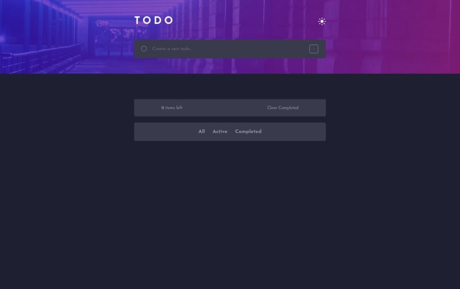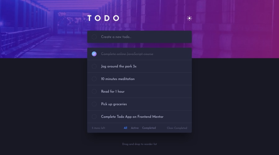
Design comparison
Solution retrospective
As it was a challenging project for me, I was unable to take the bonus challenge (for now). However, I really enjoyed coding this app, I learned a lot. I will later refactor it and implement the challenge.
Community feedback
- @RocTanweerPosted over 3 years ago
Hello 👋 @Jardel
Really nice attempt 👍 for this challenge
Suggestions 😃 :
- You should always put aria-label to inputs in case they don't have a label for accessibility issue.
- Fonts on mobile are a bit bigger, try irfan view,which calculate any part of an image, to calculate the font size and other stuffs.
- Add local storage so save bothe the theme and also the user activity.
- Add outlines to every button, input field and custom checkbox for key board user.
Hope it helps(happy coding..! )
2@JarbassPosted over 3 years ago@RocTanweer Thanks for the suggestions! I will try to implement it as soon as possible.
1 - @Lusk1nhaPosted over 3 years ago
Parabéns mano ficou legal. 😃
Eu gostei do modal que você criou.
De sugestão acho que o @RocTanweer já descreveu os pontos principais.
1@JarbassPosted over 3 years ago@Lusk1nha Valeu, mano! Vou tentar implementar essas sugestões depois. Obrigado!
1
Please log in to post a comment
Log in with GitHubJoin our Discord community
Join thousands of Frontend Mentor community members taking the challenges, sharing resources, helping each other, and chatting about all things front-end!
Join our Discord
