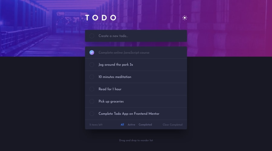
Todo-App build with React, Tailwind CSS, and Framer-Motion
Design comparison
Solution retrospective
Good day Frontend Mentor Community! Here is my solution to the Todo App challenge.
I have made this app many times which made it easier to accomplish the logic of this app. This time, I used context for state management and custom hooks for dark mode and local storage. For the color, I used custom properties and configured tailwind to match the design. Then I added reordering and animation feature using framer-motion for this challenge.
Added features:
- added animation to todo items when being added or removed
- added drag effect when reordering items
- animation for empty message base on the number of todo items
Happy to hear any feedback or advice to you all! Have a nice day!
Community feedback
- @karthik2265Posted over 1 year ago
Hey khent,
The app works well. The code also seems well organised and structured, good use of custom hooks and context for state management. Framer motion seems to be doing a good job for animations.
For some reason the light and dark mode functionality doesn't seem to be working in brave browser.
1@Lemon1903Posted over 1 year agoHey there! Thank you for your wonderful feedback :> I'm sorry about that but I don't know brave browser yet. I think I'll check on that one... thanks!
I don't know if that browser is supported in tailwind but I guess it does support it if you can see the design clearly hmmm...
1
Please log in to post a comment
Log in with GitHubJoin our Discord community
Join thousands of Frontend Mentor community members taking the challenges, sharing resources, helping each other, and chatting about all things front-end!
Join our Discord
