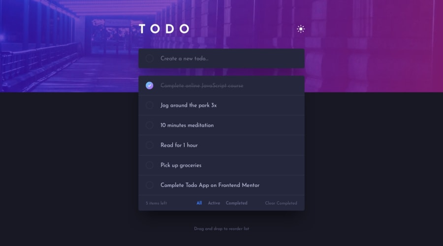
Todo with Astro, React, Tailwind and Typescript
Design comparison
Solution retrospective
This project took around 5 hours of time including some learning. I need to work on faster html markup and not get caught in details for styling. However, there were some interesting design differences in mobile / desktop so it was fun to try to come as close as possible to the designed look.
What challenges did you encounter, and how did you overcome them?I had to learn how to implement drag and drop. Nice 15 min tutorial on youtube was enough. I already implemented this in C# in game industry so it was more like learning specific syntax and event default behaviour for web.
I was introduced to dark mode in Tailwind which is pretty simple and can be used in conjuction with html attribute.
Community feedback
Please log in to post a comment
Log in with GitHubJoin our Discord community
Join thousands of Frontend Mentor community members taking the challenges, sharing resources, helping each other, and chatting about all things front-end!
Join our Discord
