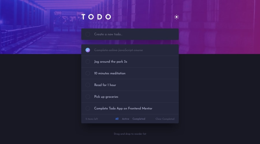
Design comparison
SolutionDesign
Solution retrospective
If you have any advice on how to structure the code better I would really appreciate it.
Community feedback
- @RodRitterPosted almost 4 years ago
Not much to gripe on. Structure is good for an app of this scale. Great job
1 - @Mosaab-EmamPosted almost 4 years ago
Love it, but I noticed that the check circle is hard to see in light mode when unchecked, I suggest to give it a darker border and it will be perfect.
1
Please log in to post a comment
Log in with GitHubJoin our Discord community
Join thousands of Frontend Mentor community members taking the challenges, sharing resources, helping each other, and chatting about all things front-end!
Join our Discord
