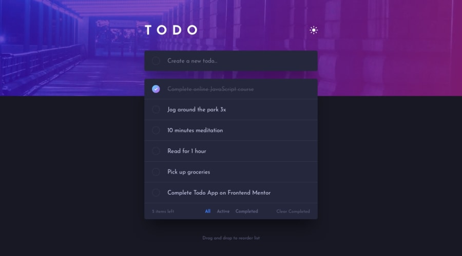
Design comparison
Solution retrospective
Im most proud of managing the usestates for the various filters in the todo list. What i would do differently next time is, using the useReducer hook, instead of usestate to manage my state more efficiently.
What challenges did you encounter, and how did you overcome them?The biggest challenge I encountered was getting the right positioning of the todo list to be slightly between the header and the body. This was very tricky for me since i was using 2 different components. I overcame this problem by studying CSS positioning more, and changing the relative and absolute position properties of my components.
What specific areas of your project would you like help with?I would like help the mobile design of the project.
Community feedback
Please log in to post a comment
Log in with GitHubJoin our Discord community
Join thousands of Frontend Mentor community members taking the challenges, sharing resources, helping each other, and chatting about all things front-end!
Join our Discord
