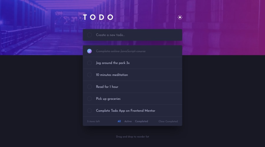
Design comparison
Solution retrospective
Hello!
It's my first time trying to implement a dark mode theme, and it was more difficult than i've thought.
First of all, creating an empty div and then populate it with classes and events through JS code required a lot of attention as they were "a div inside another div inside another div...and so on"
after, I couldn't turn 'checkbox' input into rounded instead a square box, so I created a div (through JS) and then put a style on it in css. Visually speaking, it worked! Functionally speaking? well...I can't confirm this since I still haven't added the functionality to confirm the check by the user.
Anyway, my logic in JS seems to be working, but I don't believe it's following good patterns.
if anyone can give any suggestions related to the whole project, it will be welcome and I will be grateful!
I hope you enjoy it! Regards!
P.S: I still intend implement media queries, but for now it's ok
Community feedback
- @elaineleungPosted about 2 years ago
Hi Anderson, great job here, and I think everything looks great (looking great is always the first step to success)! As for functionality, I was able to add items and remove them using the "X", but the filter options below weren't really working for me, as in they don't seem to be responding.
Anyway, one suggestion I have give here is the background image; I'm viewing this on a large screen and the image is cut off on the right. To prevent that from happening, just add
background-size: contain
and that should fix it.About a color theme, I recently had to build one as well, and I found Adam Argyle's tutorial here to be a great help: https://web.dev/building-a-theme-switch-component/
Here's the challenge I built that used the theme switcher: https://www.frontendmentor.io/solutions/responsive-calculator-built-with-vanilla-js-w9UinqToJQ
Anyway, this is a great start, Anderson!
Marked as helpful1@andykallianPosted about 2 years ago@elaineleung Hi Elaine
thanks for your suggestion about background-size. I've implemented it in project and as soon as possible going to push it to github repository.
Also, I'm going to check your links here. I think they will be such a great help! Thank you!!
1@elaineleungPosted about 2 years ago@andykallian I just checked and the background looks great! 🙂
1 - @ErayBarslanPosted about 2 years ago
Hey Anderson. Great work on your solution! To use checkbox and style as you wish you can use
appearance: none
. This is what I've used on my solution:.theme-switch { appearance: none; width: 26px; height: 26px; background-image: url('images/icon-sun.svg'); background-repeat: no-repeat; cursor: pointer; } .theme-switch:checked { background-image: url('images/icon-moon.svg'); background-position: center; }
Also you can define just one class per theme on body. Example:
.dark { --bg-color: hsl(235, 21%, 11%); --bg-content: hsl(235, 24%, 19%); } .light { --bg-color: rgb(235, 235, 235); --bg-content: white; }
Then add & remove with checkbox. You can use the variables on any element, switching class from body will be enough. Would make it much more easier to store in localStorage as well. Happy coding :)
1@andykallianPosted about 2 years ago@ErayBarslan Hello Eray! Thanks for the suggestions! I surely will try to implement these styles to a checkbox in the future!
Thanks!
1
Please log in to post a comment
Log in with GitHubJoin our Discord community
Join thousands of Frontend Mentor community members taking the challenges, sharing resources, helping each other, and chatting about all things front-end!
Join our Discord