Design comparison
SolutionDesign
Solution retrospective
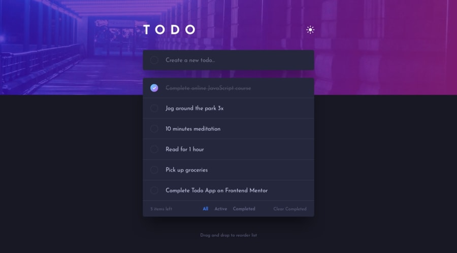
I'm curious as to how other people did that bottom bar with the number of items left, all, active, completed tabs and a clear-completed button.
I had to do a lot of playing around with the box-shadows because, to me, the items-left and clear-completed button should be in a container and the tabs should be in another and both of them should share the same parent yet they should also be separate from the todo-list.
Doing this caused a lot of issues with the box shadows (since the todo list also gets its own shadow and each one of them also need their own shadows)
Community feedback
Please log in to post a comment
Log in with GitHubJoin our Discord community
Join thousands of Frontend Mentor community members taking the challenges, sharing resources, helping each other, and chatting about all things front-end!
Join our Discord
