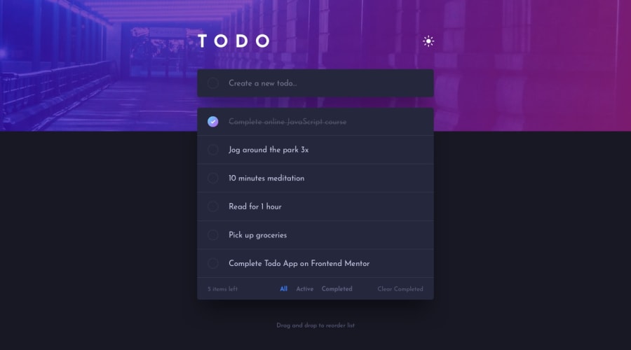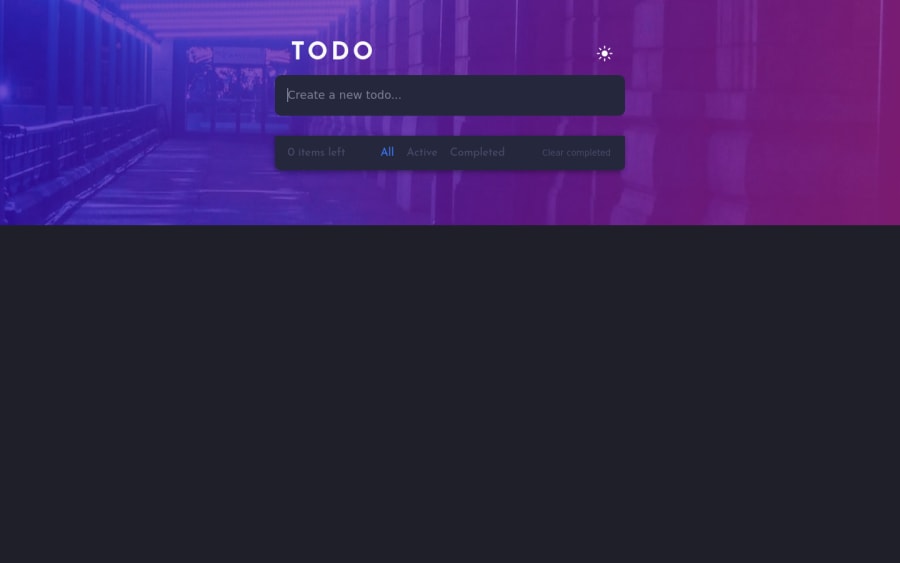
Design comparison
Solution retrospective
I'd like if you could give me some feedback, this project took me several days, although I learned a lot, one of the things that I could not do was put the icon inside the input, and I would like if someone could tell me how to fix the height:100vh option, because it is not working for me
Community feedback
- @denieldenPosted over 2 years ago
Hi Eric, I took some time to look at your solution and you did a great job!
You can fix the
heightwithmin-heigth: 100vh.Also instead of using
pxtry to use relative units of measurement -> read hereOverall you did well :)
Hope this help and happy coding!
Marked as helpful2 - @dwhensonPosted over 2 years ago
Hey Eric - what's the issue with the 100vh? It seems to be working OK to me? Your solution looks lovely!
I'm not familiar with React, but I wondered if you could possibly improve the semantics of the HTML? Ideally you could wrap all the todo items in a
uland make each todo item anli?Last small suggestions is to make the delete images a bit more obvious and wrap them in a button so that they are also nice and semantic. Again I don't know how possible this is in React?
Lovely job though - this one is tricky!
Cheers 👋
Dave
Marked as helpful1 - @ehlabradaPosted over 2 years ago
Thanks for all your suggestions and feedback, I really appreciated I'm not pretty good at semantic HTML I try do my best but always keep forget something, and what you say can be done with React I don't if you can't see it but when I use the developer tools from the browser the html and body tag doesn't grow beyond the content .
0
Please log in to post a comment
Log in with GitHubJoin our Discord community
Join thousands of Frontend Mentor community members taking the challenges, sharing resources, helping each other, and chatting about all things front-end!
Join our Discord

