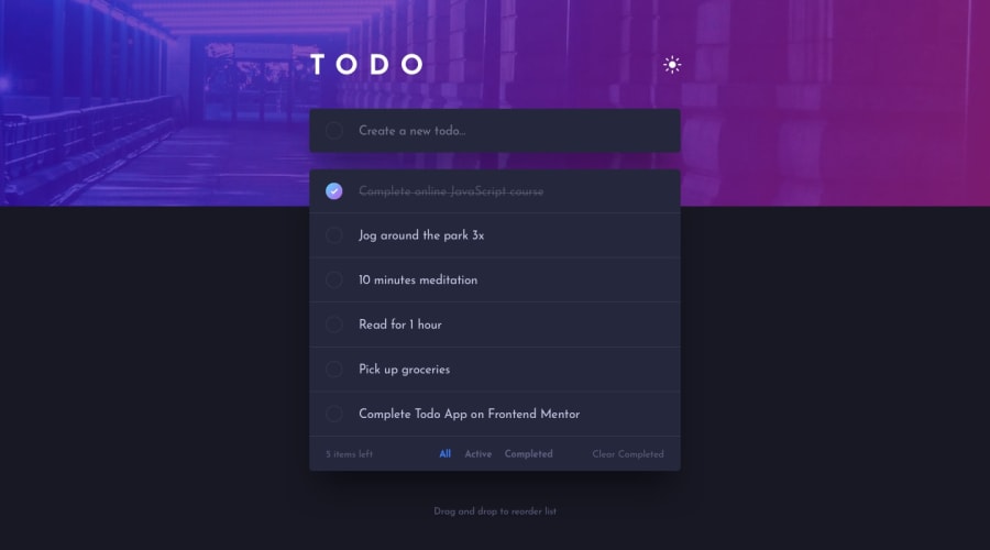
Design comparison
Solution retrospective
I had a problem with setting responsive background image, when changing from mobile to desktop, because I have two seperate images for each version. I used display in media query to manage this but I wonder how I could do this the other way. I would be grateful to get some feedback on this issue or any other feedback too.
Community feedback
- @RocTanweerPosted over 3 years ago
Hello 👋 @Pawel
Really nice attempt 👍 for this challenge
I like the transition you have on theme toggler..!
Suggestions 😃 :
- You should always put aria-label to inputs in case they don't have a label for accessibility issue. And there shouldn't be a form without submit button.
- Add local storage so save bothe the theme and also the user activity.
- Add outlines to every button, input field and custom checkbox for key board user.
Now your main request 🙂...
- What I did, I set that image as background of the header for desktop and mobile as usual. Now I made a class called light and did same thing for light theme. Now I am toggling this class 'theme' and what it does, it overrides the default background-image of header for both desktop and mobile.
Hope it helps(happy coding..! )
1@pawel975Posted over 3 years agoHi @RocTanweer!
I have fixed accessibility if it goes about add task form and added submit button instead checkbox&span. Also added a theme being saved to local storage. I'm very grateful for your feedback, thanks! :)
1
Please log in to post a comment
Log in with GitHubJoin our Discord community
Join thousands of Frontend Mentor community members taking the challenges, sharing resources, helping each other, and chatting about all things front-end!
Join our Discord
