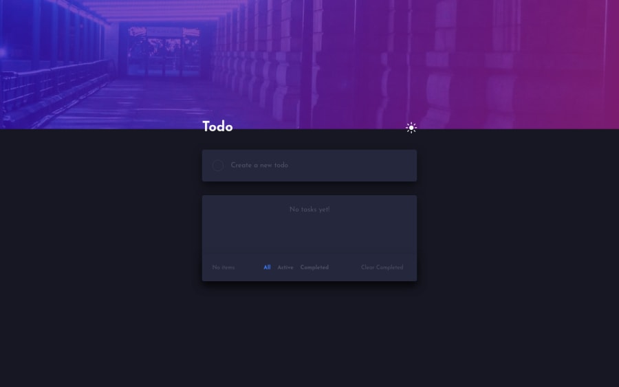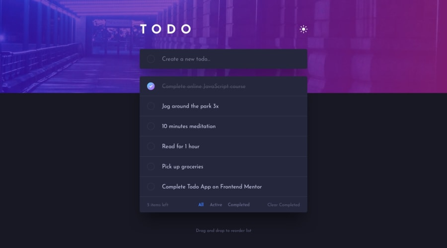
Design comparison
SolutionDesign
Solution retrospective
My styling code here is a little messy! Am totally new to styled component. If you have any pointer or feedback, don't hesitate to leave it down here~
P.s. The todos aren't stored in localstorage so they will be gone once reload page.
Community feedback
Please log in to post a comment
Log in with GitHubJoin our Discord community
Join thousands of Frontend Mentor community members taking the challenges, sharing resources, helping each other, and chatting about all things front-end!
Join our Discord
