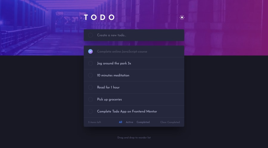
Design comparison
Solution retrospective
This project was pleasant to learn more about framer-motion, which I found really amazing. I love adding a lot of motion to this project. It was also the first time I used tailwind, and I'm blown away by the simplicity of the framework. I only used CSS to style the checkbox as it seemed to be more efficient, but I could have use tailwind as well. I also change the background to something a bit more personal.
I would love to add a pan option like in iOS to delete items from the list. It would be possible with framer-motion, and it would be nice to take some time to look at it.
Any feedback and suggestion is welcome!
Rémy
Community feedback
Please log in to post a comment
Log in with GitHubJoin our Discord community
Join thousands of Frontend Mentor community members taking the challenges, sharing resources, helping each other, and chatting about all things front-end!
Join our Discord
