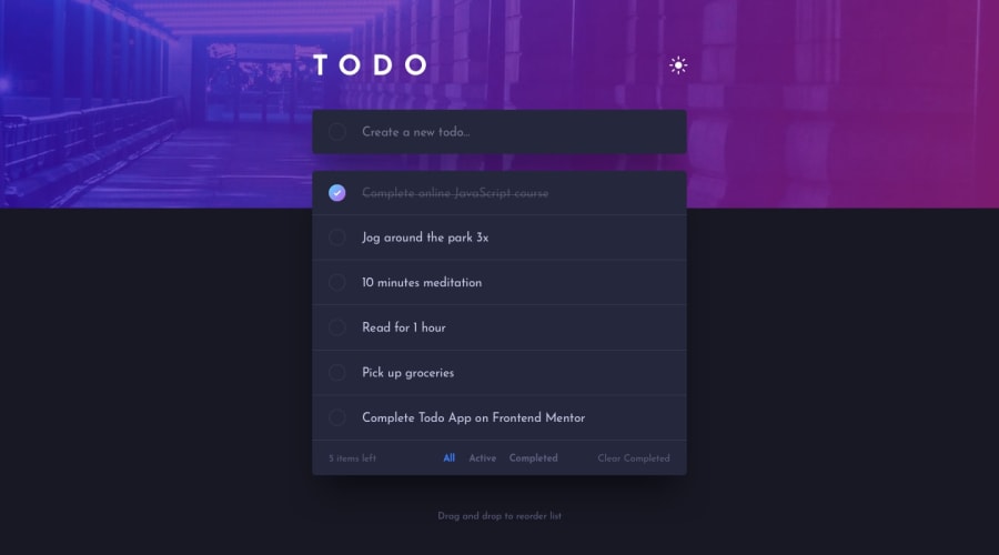
Design comparison
SolutionDesign
Solution retrospective
Light and dark mode while trying to keeping the users choice was fun to figure out so that the app would keep the users selection by using local storage
Community feedback
- @zineb-BouPosted over 2 years ago
Hi there, Good job on this challenge, I am dropping some comments that may help you to improve your solution even further.
- The App container
class=” App”is not taking the full-screen height, so instead of writingheight:100vh,min-height:100vhwill do the job. - I recommend using a different shadow to the to-do list wrapper, it looks a bit odd on the dark mode.
- Sun/Moon toggle actually it is a button, so instead of using
<div>, use<button>with anaria-label=” toggle theme”, since there is no textual indication of the button purpose, we still need to provide alternative text for users who use assistive technology, (the same thing applied to the delete button and the checkbox)
Happy coding
0 - The App container
Please log in to post a comment
Log in with GitHubJoin our Discord community
Join thousands of Frontend Mentor community members taking the challenges, sharing resources, helping each other, and chatting about all things front-end!
Join our Discord
