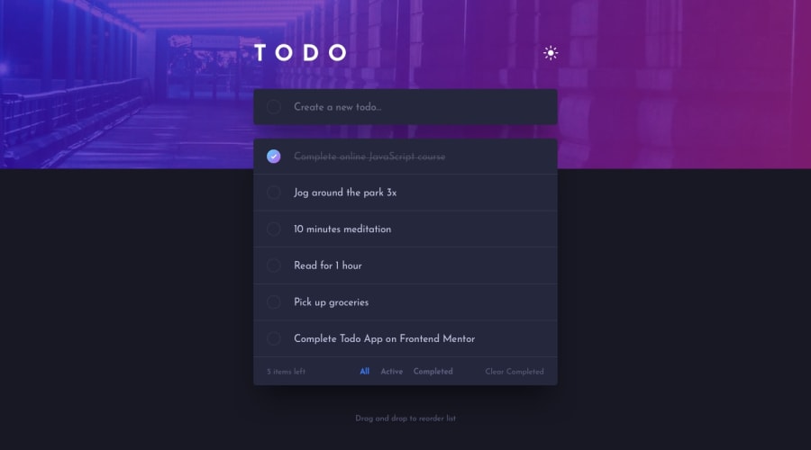
Design comparison
SolutionDesign
Community feedback
- @emadbakryPosted over 1 year ago
nice work, you just need to care about the bottom nav, it should have good padding around it, so we can hover over it easily
Marked as helpful0
Please log in to post a comment
Log in with GitHubJoin our Discord community
Join thousands of Frontend Mentor community members taking the challenges, sharing resources, helping each other, and chatting about all things front-end!
Join our Discord
