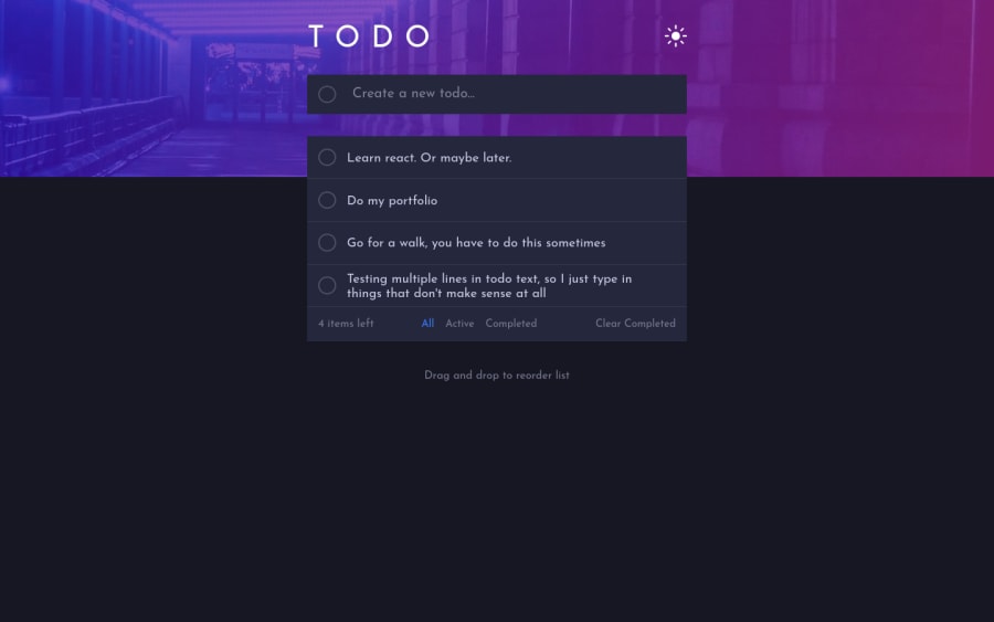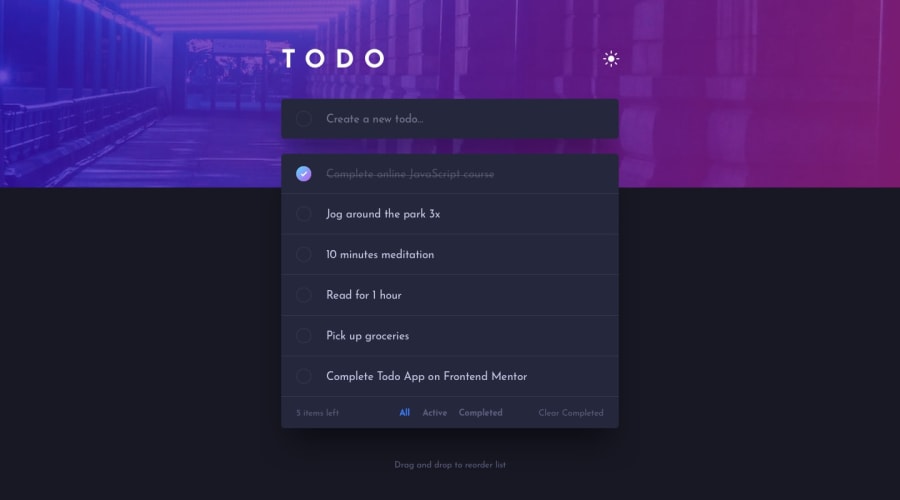
Design comparison
Solution retrospective
It was an interesting challenge for me, I'll be happy if you'll look on my solution and point out my mistakes
Community feedback
- @MathisHumbertPosted about 3 years ago
Hi! Nice work, everything seems to work! This looks great and responsive, good job!
I think you could improve your app using localhost to save the user's theme and list items.
Also you handle the color theme in js by changing each element. A better approach is to toggle a classList on the html element and in css user the html element and the classList name to change the root color.
For example
:root{ --main-color: #fff }
.darkhtml { --main-color: #222; }
Marked as helpful1@andy-devsPosted about 3 years ago@MathisHumbert Hello, thanks for your feedback! It was informative, I learned something new for myself
0
Please log in to post a comment
Log in with GitHubJoin our Discord community
Join thousands of Frontend Mentor community members taking the challenges, sharing resources, helping each other, and chatting about all things front-end!
Join our Discord
