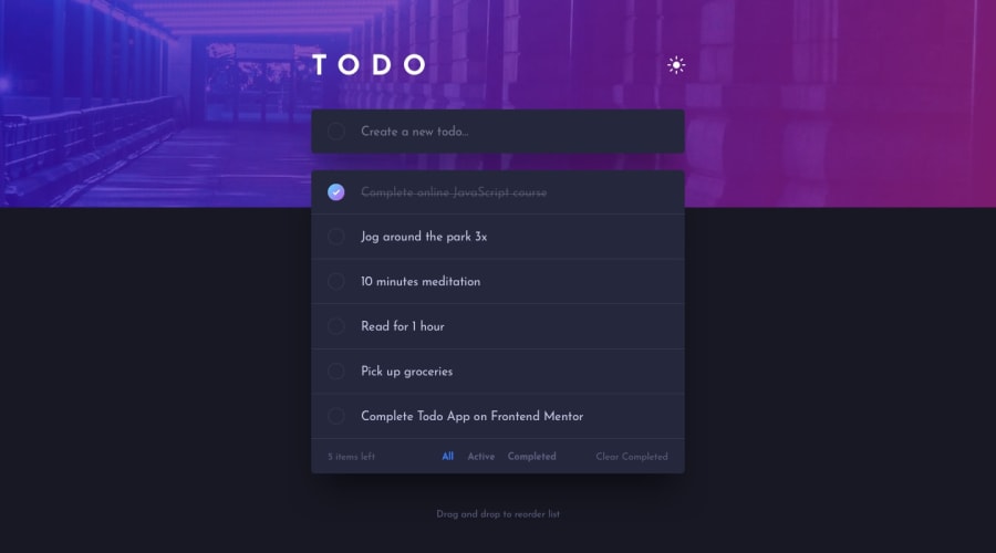
Todo app with drag-and-drop and light/dark modes using React
Design comparison
Solution retrospective
What did you find difficult while building the project? Implementing the custom checkbox, in particular ensuring that it stays reusable and progressively enhanced. I used an SVG sprite combined with the <use> element to reduce inline SVG bloat as the number of todo items increase.
Which areas of your code are you unsure of? I have added focus rings for basic accessibility, but I haven't done enough testing to manage the focus after some events, like when the user deletes a todo item.
Do you have any questions about best practices? I plan to refactor the logic into custom hooks to keep the code organized. Aside from that, what are other ways I could improve this React project?
Community feedback
Please log in to post a comment
Log in with GitHubJoin our Discord community
Join thousands of Frontend Mentor community members taking the challenges, sharing resources, helping each other, and chatting about all things front-end!
Join our Discord
