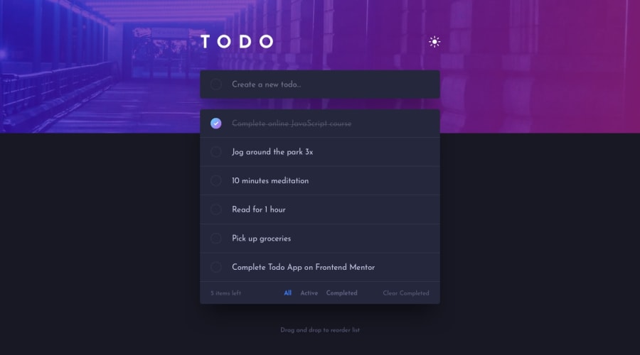
Design comparison
Solution retrospective
My main goal was to use a structured Way of Working so that any developer would understand the flow of my app. For this reason I'm proud of how I have handled state flow with Pinia.
What challenges did you encounter, and how did you overcome them?It took some time before I came up with a solution for filtering that wasn't gonna be overcomplicated. At first I was trying something that was really just overengineering for my use case. From there I simplified my filter system.
What specific areas of your project would you like help with?I rushed the responsive design part of the filter container. I would like to know how others would ideally handle responsivity for that specific div/container.
Community feedback
- @snhasePosted 7 months ago
Hello Rick,
Your solution looks great! Like how you added icon in front on the items to indicate there are draggable.
I just completed this challenge myself, how I handled the responsive filter was, to make the filter as reusable component and to show/hide component using display visibility attribute when the breakpoint changes. Hope this helps!
0
Please log in to post a comment
Log in with GitHubJoin our Discord community
Join thousands of Frontend Mentor community members taking the challenges, sharing resources, helping each other, and chatting about all things front-end!
Join our Discord
