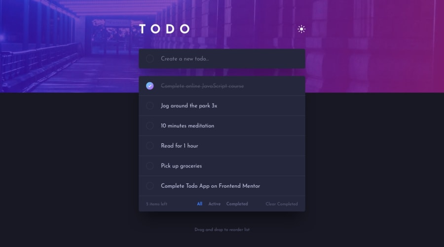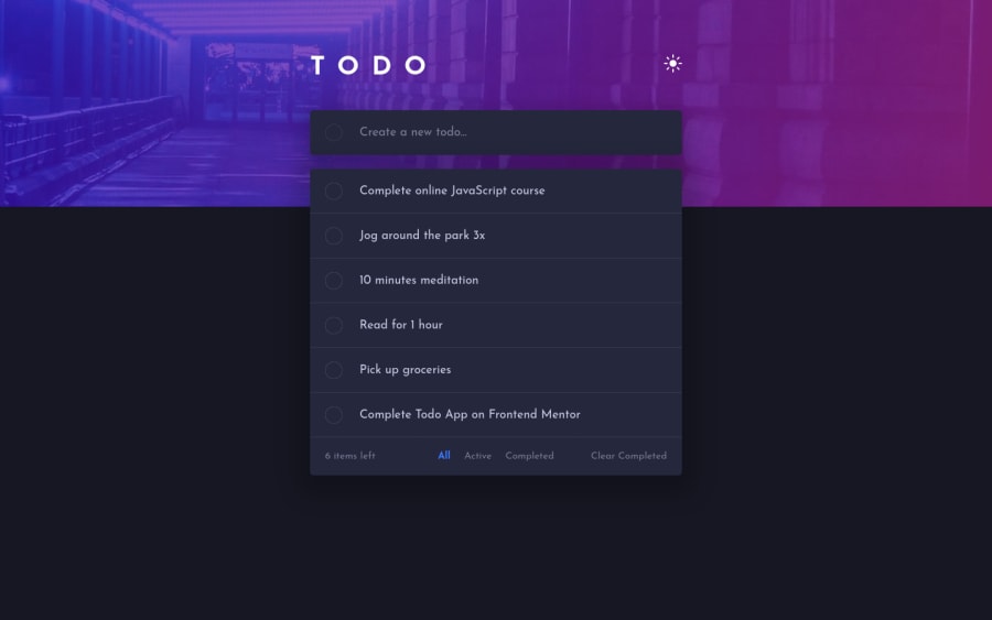
Design comparison
Solution retrospective
Finally wrapped this one up, polished to the end, besides the drag and drop to reorder feature, might add that at some point.
Learned a bunch on this one, but if I can learn to do something a bit better, I'm open to all feedback.
Community feedback
- @pikapikamartPosted almost 3 years ago
Hey, awesome work on this one. The layout in general looks great, just tried it the todo-app works, but there are some limitations on it since you are not using proper interactive elements as the toggle for the events.
Some suggestions would be:
- Avoid using
height: 100%
height: 100vh
on a large container like thebody
orhtml
as this makes the element's height capped based on the viewport/screen's height. Instead usemin-height: 100vh
so that the element will expand if it needs to. - Your
h1
. When making a text uppercase, do not directly type the word in the markup capitalized. Doing this results screen-reader reading the text letter-by-letter and not by word. Instead just use regular lowercase text and just usetext-transform: uppercase
on it on the css. - For the theme toggle, right now it is only limited for mouse clicks because you are using
img
tag as the toggle which is wrong. When creating interactive components, make sure that you are using interactive elements. For this one or any other theme toggle, the markup should be using radio-buttons which is inside of afieldset
along with alegend
tag that will describe what is the purpose of the sets ofinput
. Have a look at this simple jsfiddle snippet that I have for theme toggle, you can tweak with the codes and do stuff on it. Also, you can look at my solution on this same challenge as well. I implemented that one so have a look at it you want :> - When using
img
tag, you don't need to add words that relates to "graphic" such as "icon" and others, sinceimg
is already an image so no need to describe it as one. - Also, those icon on the theme toggle are all decorative. Decorative images should be hidden for screen-reader at all times by using
alt=""
andaria-hidden="true"
to theimg
tag or onlyaria-hidden="true"
if you are usingsvg
instead ofimg
tag. - Only use descriptive
alt
on images that are meaningful and adds content to the site otherwise hide the image for screen-reader users. - For the circle one on the input for adding todo, I don't really know if that should be an element, for my solution I only used it as a
box-shadow
. Since you are using it here as a submit, what you should do instead is that, usebutton type="submit"
and place it after theinput
:
<form class="input-form light-theme" spellcheck="false"> <input type="text" class="input" placeholder="Create a new todo..."> <button type="submit" class="submit-task"> <span class="visually-hidden">Submit todo item</span> </button> </form>
This way, the focus after typing a todo-item will be on the submit-button. Use a screen-reader only text as well for the
button
or anaria-label
.- Also, it would be really nice to have an
aria-live
element that will announce whether the todo-item submitted is a success or not. For example, if I inputeat cotton candy
, the live-element will announce something likeeat cotton candy added
. This way, user will know right away what happen after they submit, you can have like an error-message as well on this one. - You can use
ul
on those todo-items since those are "list" of todo-items right. - For each of those todo-item, those circle on their left are
input type="checkbox"
and nottype="image"
. Also, theclick
event is not placed on theinput
on this one, you placed it on thediv
which is not great because using that one, you are excluding lots of users to use your app. Interactive elements must be use for interactive components. Place the event on theinput
, the todo-item-name could be thelabel
for their respective todo, uselabel
and notp
tag. - The todo-item remove-button should be using
button
and notinput type="image"
. Also, there is no visual-indicator on it when you navigate usingtab
key on your keyboard on it. Always have an indicator on the:focus-visible
state on an interactive element. - The remove-button could have a screen-reader text or
aria-label
describing what it would do. It could be likearia-label="remove cotton candy todo item"
. The todo-name should be different for other todo-items. - Again, an
aria-live
announcing a todo-item removal would be really nice so that it will be informed to the user quickly what happened. nav
is not needed in here sincenav
typicall contains the navigational links on the site and there are none on this one.- For the
clear, active, completed and clear completed
again, they are interactive components, usebutton
for each one. - Also, an
aria-live
announcing what tab has been selected. For example, I toggled theactive
tag, the live-element will announce something likeshowing active todo-items
.
This challenge will really test your accessibility knowledge as there are lots of places to include it on this one.
But still, great job again on this one.
Marked as helpful1@RobertK0Posted almost 3 years ago@pikapikamart Wow that is extremely detailed, thank you for taking the time to write all this out :)
And honestly kinda made me realize I should get back to my courses, to actually learn what half of these things are. Gonna rewrite it from scratch then, taking your advice. Would be a lot messier if I tried to stitch this frankenstein's monster into something proper atm.
1 - Avoid using
Please log in to post a comment
Log in with GitHubJoin our Discord community
Join thousands of Frontend Mentor community members taking the challenges, sharing resources, helping each other, and chatting about all things front-end!
Join our Discord