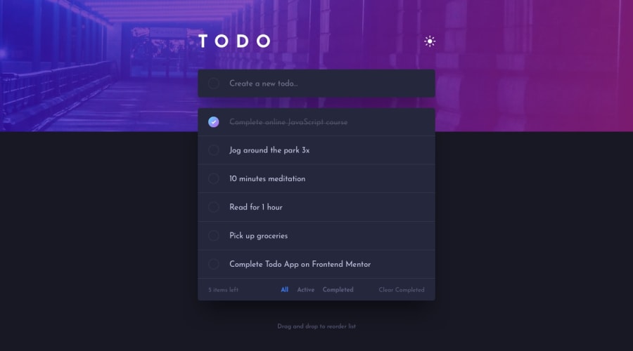
Design comparison
SolutionDesign
Solution retrospective
Feedback would be welcomed
Community feedback
- @gsterczewskiPosted almost 4 years ago
Hello Leonel,
I like your work on this 👍. Your js is well organized and easy to understand, which I struggle with.
I have a few suggestions :
- Consider adding label to
.input__todo, since it would help with accessibility. -I think your could tweak box-shadow on.todossince in blends with the background on light mode too much. -It would be nice to add some better support for keyboard users, e.g. set focus on todo and mark it or delete it with key press. Right now I can only set focus on .input__todo - How about setting
cursor:poineron.header__theme-switcherto indicate that this element is interactive?
Anyway, thats my suggestions for little improvements, overall you did great job 👏.
Have a good day. Cheers!
0@leonelmequePosted almost 4 years ago@GSterczewski Thank you for the tips, I will make the changes when I get the chance.
0 - Consider adding label to
- @abhik-bPosted almost 4 years ago
Hi Leonel ,
You have done a great job on this challenge , I really liked the class based approach you took💯.
Great job 👌👌
Keep it up 💯
0
Please log in to post a comment
Log in with GitHubJoin our Discord community
Join thousands of Frontend Mentor community members taking the challenges, sharing resources, helping each other, and chatting about all things front-end!
Join our Discord
