


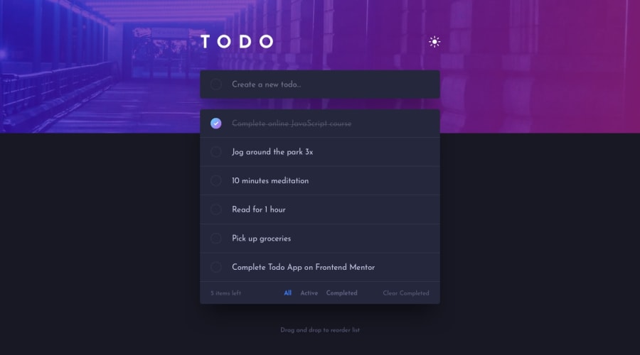
Design comparison
Solution retrospective
Sometimes gradient in CSS does not work. I tried using linear-gradient and webkit but never work. It shows white instead. Code is in my App.css.
Community feedback
- @taqhPosted over 1 year ago
Hello ken 👋.
I'm assuming you're talking about the gradient background on the chekbox.
I went through your CSS and couldn't find where you tried to use it but you can try this
.check-box:checked {
   background: url('../images/icon-check.svg'),
      linear-gradient(to bottom right, hsl(192, 100%, 67%), hsl(280, 87%, 65%));
   background-repeat: no-repeat;
   background-position: center;
   outline: 0;
   transition: background 0ms;
}
I also noticed you're trying to set a gradient border to the checkbox on hover
.check-box:hover {
  border-color: var(--check-bg);
  cursor: pointer;
}
This wont work as you cant set gradients to borders. To do that you can use the border-image property however it does not work very well with a border radius. So the easiest way to achieve something close would be to do this:
.check-box:hover {
   border-top: solid .1rem hsl(192, 100%, 70%);
   border-left: solid .1rem hsl(192, 100%, 70%);
   border-right: solid .1rem hsl(280, 87%, 80%);
   border-bottom: solid .1rem hsl(280, 87%, 80%);
   outline: 0;
}
You can click here for more alternatives on setting gradient borders in css
Hope you find this helpful 😄
1 - @0xabdulkhaliqPosted over 1 year ago
Hello there 👋. Congratulations on successfully completing the challenge! 🎉
- I have other recommendations regarding your code that I believe will be of great interest to you.
HTML 🏷️:
- This solution generates accessibility error reports, "All page content should be contained by landmarks" is due to
non-semanticmarkup, which lack landmark for a webpage
- So fix it by replacing the
<div class="root">element with the semantic element<main>in yourindex.htmlfile to improve accessibility and organization of your page.
- What is meant by landmark ?, They used to define major sections of your page instead of relying on generic elements like
<div>or<span>
- They convey the structure of your page. For example, the
<main>element should include all content directly related to the page's main idea, so there should only be one per page
.
I hope you find this helpful 😄 Above all, the solution you submitted is great !
Happy coding!
0


Please log in to post a comment
Log in with GitHub
Join our Discord community
Join thousands of Frontend Mentor community members taking the challenges, sharing resources, helping each other, and chatting about all things front-end!
Join our Discord