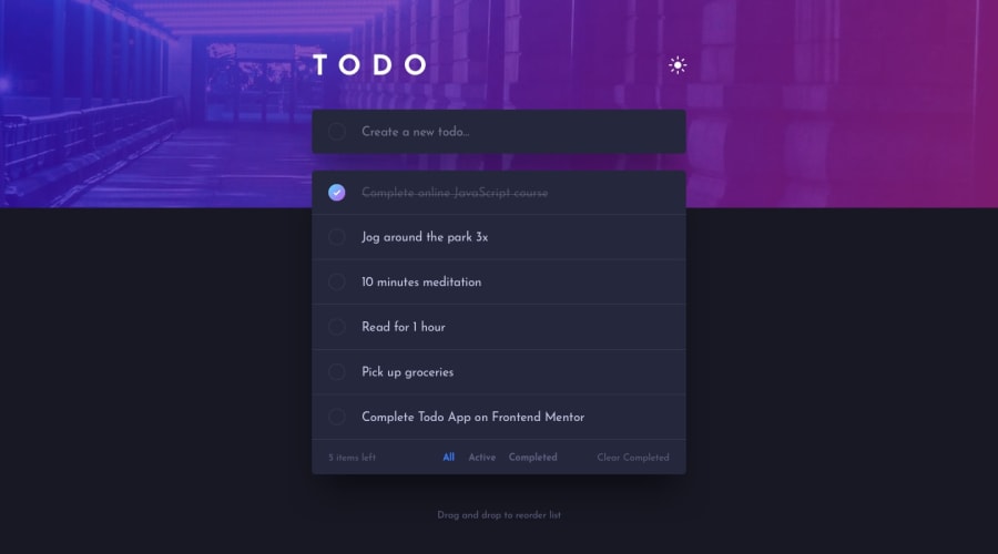
Design comparison
Solution retrospective
I definitely had a lot of fun with the theme switcher here. Also, this project was a nice opportunity to practice typescript, but I finished it quite some time ago so I'm not sure what I did struggle most with. General feedback welcome!
Community feedback
- @Deevyn9Posted over 2 years ago
Hi Adam, great solution, it looks really great and is functioning properly... i also noticed some extra effects you added 😉. I also find some little things you can work on;
(i) when the animation for the theme switcher plays, there is a little radio button appearing in the background and seems to fade out a little.
(ii) the list of todos scroll when they become numerous.
(These were noticed on a device with 375px width)
Happy coding 🎈
0@AdamMintajPosted over 2 years ago@Deevyn9 many thanks for looking at my work :) I still can't spot that radio button appearing, but I'll keep working on that I guess. Where you using chrome when you noticed that?
Also, the scroll on the list was intentional, I thought that I'll rather have a website that fits in the screen and then scroll through the items than have a website that gets longer and longer with every next item. Maybe that's not the optimal solution but it's what I thought would be better. What would you recommend here?
0@Deevyn9Posted over 2 years ago@AdamMintaj firstly, I’m using safari.
About the scroll, i understand where you’re coming from now, i initially thought it wasn’t intentional.
My recommendation is always to do what works for you.
Good luck
0
Please log in to post a comment
Log in with GitHubJoin our Discord community
Join thousands of Frontend Mentor community members taking the challenges, sharing resources, helping each other, and chatting about all things front-end!
Join our Discord
