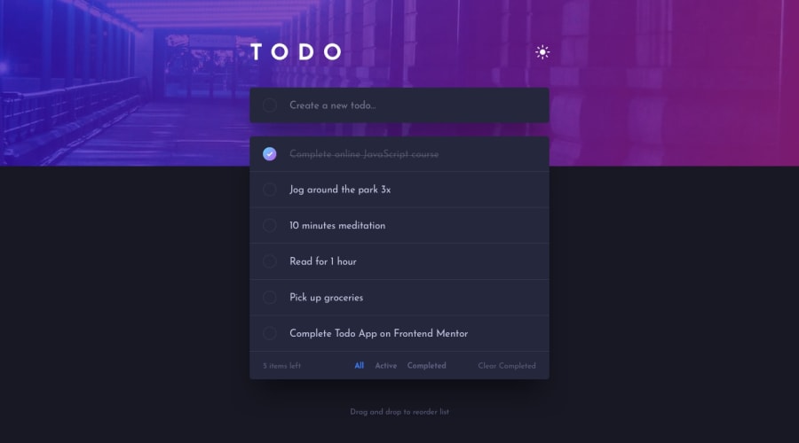
Design comparison
Solution retrospective
any feedback is welcome!
Community feedback
- @al3xbackPosted almost 3 years ago
Hi Natasya,
Looks like for the header bg is not fully cover the entire screen, esc when viewed on larger device. Try to zoom out the browser and see.
My feedback is:
- add full width to
.header__bg__imageand inheritance to.header__bg__image imgselector.
.header__bg__image { ... width: 100%; } .header__bg__image img { ... width: inherit; }- for All, Active, Completed, and Clear Completed would be good if we set it into button element.
<button type="button">All</button>
<button type="button">Active</button>
<button type="button">Completed</button>
<button type="button">Clear Completed</button>
Marked as helpful2@notanutPosted almost 3 years ago@al3xback thank you so much for the reply! i noticed that too and wanna find a way to fix it. glad you noticed! 👌
0@notanutPosted almost 3 years ago@al3xback fixed. can you please kindly take a look? thanks! :)
0@al3xbackPosted almost 3 years ago@notanut ups i missed one for the
.list__deletewould be good if we also put it into button :)and this is optional, i believe this will be good if applied.
.list__wrapper .circle {
   ...
   display: flex;
   align-items: center;
   justify-content: center;
}

.list__wrapper .circle img {
  transform: ...; // remove this cos we don't need anymore.
}
that's all~
Marked as helpful0@notanutPosted almost 3 years ago@al3xback thank you so much for taking your time to looking through at my code! I'm currently doing a challenge so maybe I will fix it after it finished.
0 - add full width to
Please log in to post a comment
Log in with GitHubJoin our Discord community
Join thousands of Frontend Mentor community members taking the challenges, sharing resources, helping each other, and chatting about all things front-end!
Join our Discord
