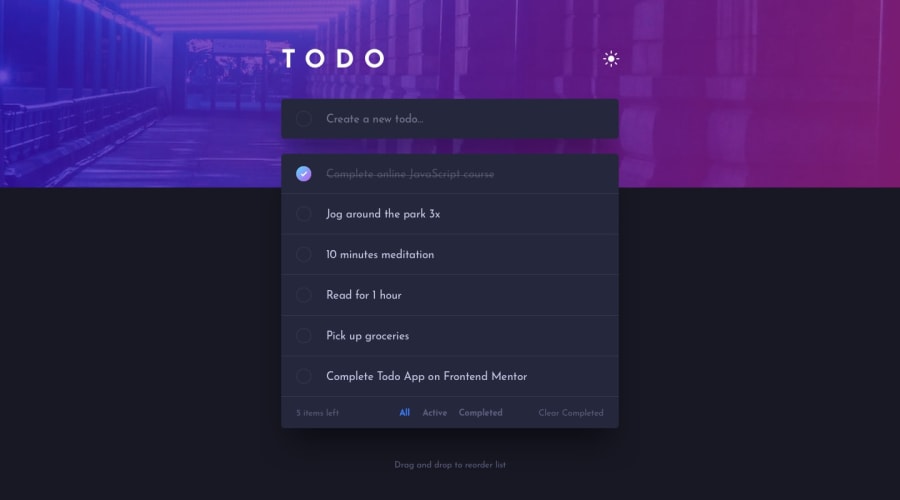
Design comparison
SolutionDesign
Solution retrospective
Nice project to practice React.
What would be the best practices?
Community feedback
- @PeshwariNaanPosted about 2 years ago
Hello Cesar - Great job on completing the challenge. Things look pretty good.
Here are a couple tips that might help:
- Set your background image width to 100% or 100vw to adjust for bigger screen sizes. I know the design is given with a width of 1440px which is fine for building the layout but it should still be able to adjust to something bigger. If you look at the page with a bigger screen, there is a big gap on the right side.
- Add a check in the input logic to look for an empty string. This will prevent the user from adding a bunch of empty todos. In your
onAdd()put something likeif (task === '') return; - In your index.html, wrap
<div id="root"></div>with a<main>tag and it should get rid of some of the html errors you are getting.
Hope this helps - Happy coding
Marked as helpful1@CesarGMEFAPosted about 2 years ago@PeshwariNaan Ready. I have made the recommended changes.
0
Please log in to post a comment
Log in with GitHubJoin our Discord community
Join thousands of Frontend Mentor community members taking the challenges, sharing resources, helping each other, and chatting about all things front-end!
Join our Discord
