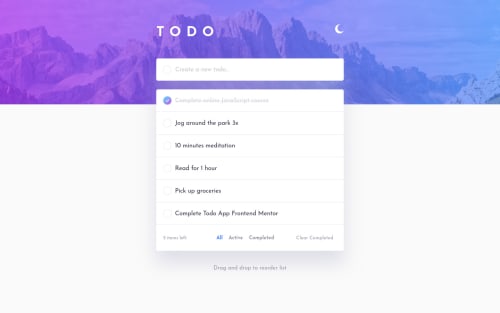
Design comparison
Solution retrospective
Hey, there! 🙋🏻
I've had a great time working on my first challenge on Frontend Mentor. 🤗
I'd appreciate feedbacks on:
- what can be improved on the way the code is structured.
- any ideas on how to fix the HTML validation errors.
Here's a list of useful resources I learned a lot from when working on this challenge:
- Gradient Borders in CSS
- How I Theme My React App With Sass
- Sass Essential Training
- Sass mixin to have multiple theme based background images
- Session Storage and Local Storage in React
- How to Add Drag and Drop in React with React Beautiful DnD
Happy coding, everyone! 🙃
Community feedback
- @ApplePieGiraffePosted almost 4 years ago
Hey, mi souto! 👋
Nice work! Your solution looks good and the drag-and-drop functionality works great! 👍
However, I don't seem to be able to delete items from the to-do list by clicking on the "X" icon (it marks the to-do item as completed instead). You might want to look into that to see what's going on. 😉
I also suggest switching to a mobile-friendly layout a little sooner to prevent the content of the page from looking too squeezed or anything (some of the content gets cut off the screen a little) right before the layout changes.
Keep coding (and happy coding, too)! 😁
1@mileinePosted almost 4 years ago@ApplePieGiraffe, I appreciate your feedback! 🙏
Yeah, you're right... there's sth going on with the "X" icon... I totally missed it! This is so embarrassing, but I'll get it done ASAP. I really need to spend more time planning before coding... 😅
Yesterday I noticed the content gets cut off on my phone, then I started wondering if I needed an extra breakpoint... But I'll test just switching to mobile-friendly a little sooner as you suggested. Thanks again! 😊
0 - @abhik-bPosted almost 4 years ago
Good work Mi 👌
-
you can use the circle in input as a button and set it's type to submit that will fix the acccessibility issue
-
unfortunately I could not see your github code but I hope after you refactor all your html issues will be fixed
1@mileinePosted almost 4 years ago@abhik-b, thank you so much for your feedback! 🙏 I'll use the circle in input as button as you said. I also changed my repo visibility to public. Perhaps I should also be saying: "Excuse... the mess?" 😅 Unfortunately, I didn't take enough time to plan before code, now I have a lot of refactoring to do.😱 Lesson learned for next time. 😇
0 -
Please log in to post a comment
Log in with GitHubJoin our Discord community
Join thousands of Frontend Mentor community members taking the challenges, sharing resources, helping each other, and chatting about all things front-end!
Join our Discord