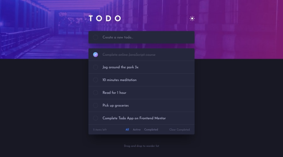
Design comparison
SolutionDesign
Solution retrospective
What are you most proud of, and what would you do differently next time?
I'm proud that I finished this project and it's fully functional. Next time I'll implement the drag and drop functionality. For the moment I didn't understand how it worked. And next time I will respect the entire design :)). This time I kept the filter buttons on the bottom of the app in both designs (mobile & desktop).
What challenges did you encounter, and how did you overcome them?The challenge was with the 3 buttons from the bottom of the app. I forgot how to implement rendering something that depends on state modification. Until I remembered the "use effect" hook.
Community feedback
Please log in to post a comment
Log in with GitHubJoin our Discord community
Join thousands of Frontend Mentor community members taking the challenges, sharing resources, helping each other, and chatting about all things front-end!
Join our Discord
