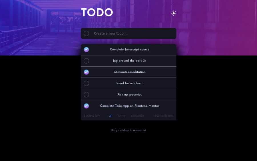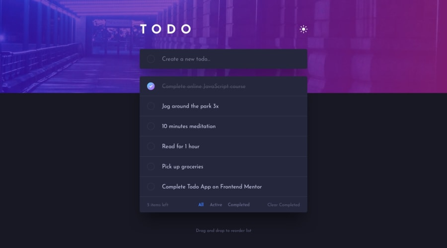
Design comparison
Solution retrospective
Finishing this challenge is a hard work! felt proud of myself, after finishing a begginer's course in react, I applied what I've learned through this challenge and I've also learned something new while doing this project which is the drag and drop feature. I learned about react-dnd for the first time and I've also applied the new @use & @forward feature of SASS since @import will soon be deprecated so I thought myself to practice this new feature earlier. 😊 Any feedbacks are warmly welcome. As Im relatively new to react I am not sure if I my code is a best practice or not. Happy coding yall!
Community feedback
- @denieldenPosted over 2 years ago
Hi Liezl, great work on this challenge! 😉
Here are a few tips for improve your code:
- to make it look as close to the design as possible add
justify-content: start and gap: 1remtotask-itemclass - i can add task also with blanks, add a control... The
trim()method can help you -> read here - instead of using
pxuse relative units of measurement likerem-> read here
Overall you did well 😁 Hope this help!
Marked as helpful0 - to make it look as close to the design as possible add
Please log in to post a comment
Log in with GitHubJoin our Discord community
Join thousands of Frontend Mentor community members taking the challenges, sharing resources, helping each other, and chatting about all things front-end!
Join our Discord
