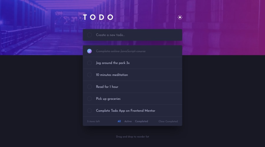
Design comparison
SolutionDesign
Solution retrospective
Hi! I would appreciate it if you give me feedback on how I made:
- Light and Dark mode logic
- CSS responsive style
It's the first time I do a light and dark mode, so I would like to know in what could improve :D
Community feedback
Please log in to post a comment
Log in with GitHubJoin our Discord community
Join thousands of Frontend Mentor community members taking the challenges, sharing resources, helping each other, and chatting about all things front-end!
Join our Discord
