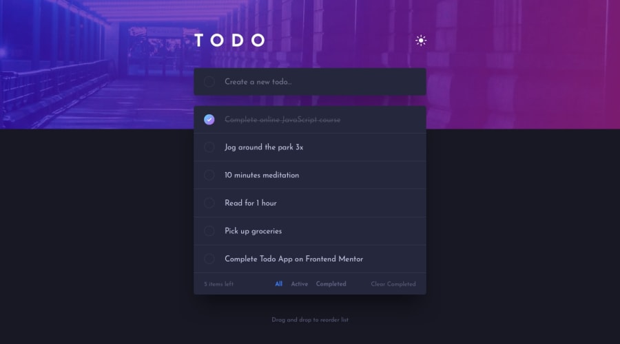
Design comparison
SolutionDesign
Solution retrospective
Had some issues with the checkbox buttons when hovering you can see they're not aligned as a perfect circle, will be happy to hear how to fix that. Also not sure about how to do the accessibility with React. Thanks!
Community feedback
Please log in to post a comment
Log in with GitHubJoin our Discord community
Join thousands of Frontend Mentor community members taking the challenges, sharing resources, helping each other, and chatting about all things front-end!
Join our Discord
