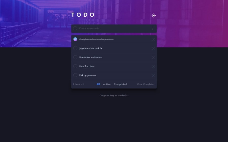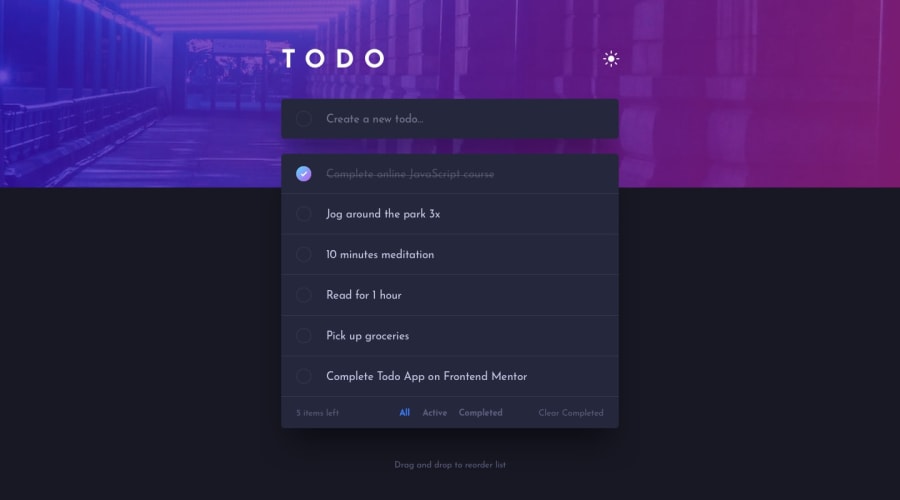
Design comparison
Solution retrospective
Hello, Frontend Mentor community! 😊
For this project, I was excited to meet all the requirements 😄🎯, and I also wanted to add some extras to practice new techniques 🚀🔥.
It's the first React project I upload to this platform, so there are probably many things to improve in the code. 😅
I added the ability to edit the task ✏️✅, as well as a menu with options to sort the list 📋⬆️⬇️.
On the other hand, I used the CSS property:
overflow-y: auto;
to add a scrollbar to the task list, so the container wouldn't become too tall 📜🔽.
I also flirted with using animations, for which I still don't feel completely confident, but I want to start learning more about that topic to incorporate it into future projects 💃📚🌟.
It was also my first time handling the switch from dark mode to light mode 🌗🌞
Community feedback
Please log in to post a comment
Log in with GitHubJoin our Discord community
Join thousands of Frontend Mentor community members taking the challenges, sharing resources, helping each other, and chatting about all things front-end!
Join our Discord
