Design comparison
SolutionDesign
Solution retrospective
What should be improved?
Community feedback
- @mattari97Posted over 2 years ago
Hello.
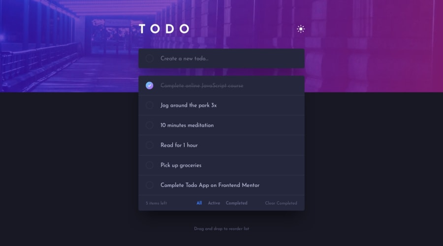
Some small improvements would be:
-
add a border between the last todo and the stats section like on the design.
-
listen the "blur" event on the input and to reset it when it loses focus.
-
Add the cercle at the left of the input like on the design
-
increase the space (left & right) on mobile because it is really close to the sides of the screen
Peace
Marked as helpful0 -
Please log in to post a comment
Log in with GitHubJoin our Discord community
Join thousands of Frontend Mentor community members taking the challenges, sharing resources, helping each other, and chatting about all things front-end!
Join our Discord
