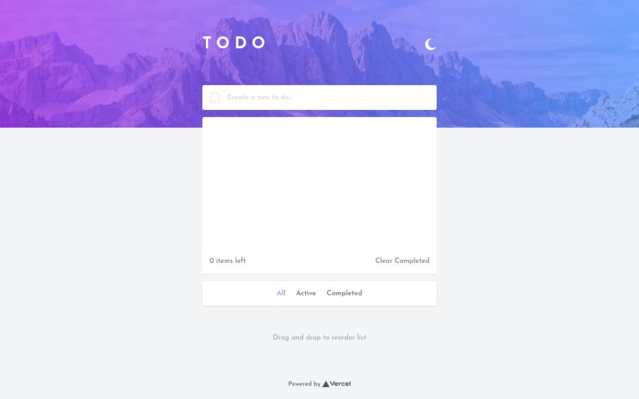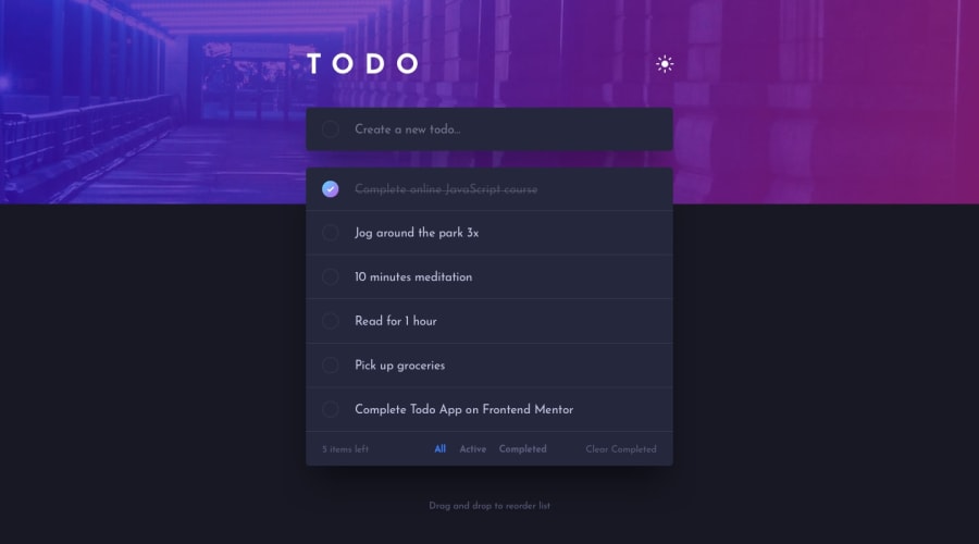
Design comparison
Solution retrospective
Maybe it is exaggerated, the reason is that I am learning typescript and nextjs at the same time. I accept suggestions :D
Community feedback
- @grace-snowPosted almost 4 years ago
Hi, this looks nice well done.
Like @ApplePieGiraffe says, the todo list container needs to be able to grow. You can't put a scroll on it while also using drag and drop because on mobile that means I can't get to the lower down todos. It drags them when I'm trying to scroll them, if that makes sense.
Once that's changed this will work great on mobile!
1 - @ApplePieGiraffePosted almost 4 years ago
Hey, nice work on this challenge, Chara! 👍
The to-do list looks good and works pretty well! 👏
I only suggest perhaps allowing the height of the to-do list to grow with the todos that are added to it—that'll make it a little easier for users to see more of the todos that they have without the need to do very much scrolling. 😉
Keep coding (and happy coding, too)! 😁
1
Please log in to post a comment
Log in with GitHubJoin our Discord community
Join thousands of Frontend Mentor community members taking the challenges, sharing resources, helping each other, and chatting about all things front-end!
Join our Discord
