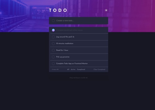
Design comparison
Solution retrospective
Hello everyone 👋, I'm Mohammed and this is my solution to this nice challenge.
This challenge was my first interaction with drag-and-drop API. I enjoyed doing the challenge very much.
Built with 🛠
- Semantic HTML5 markup ✔
- CSS custom properties 🎨
- CSS Flexbox🎁
- Mobile-first workflow 📱
- PixelPerfect chrome extension👌
- Responsively✌
- Web ToolBox⚒
What I learned
- DOM traversing, DOM attribute manipulation
- Drag and drop API
Continued development
- Drag and drop API
- Background images sizes
Useful resources
Author
- Twitter -[https://twitter.com/javascriptor1]
Community feedback
- @BlackpachamamePosted 10 months ago
Hey your solution is amazing! 🤩
This was a bit of a long challenge and you handled it very well.
📌 Some suggestions
- To improve the semantics of your HTML, you can change your
<div class="container">
to a<main class="container">
- In the future you could try to add persistence in the data, that is, when refreshing the page, the user continues to see the tasks they added and the topic they chose
- On desktop screens, if the task text has more than 2 lines, passing the cursor over said task causes the checkbox to slide a little to the left and appear cut off
- The mobile version looks poorly aligned because you applied a
position: relative
andleft: 10px
Marked as helpful0@javascriptor1Posted 10 months agoHi @Blackpachamame,
Thanks for the valuable feedback you provided.
-
For the container , I guess it is better to use
div
as I usedmain
for the todo list itself. The cotnainer includes the header which should not be part of main section. -
I added localStorage already.
-
Yes - you are right. I will look into this issue in the future when I come back to improve this application and add more functionality to it.
-
I fixed the mobile version alignment. The reason for this problem was not relative position as you indicated but rather assigning a fixed width to the mobile style for the container.
I moved the styling to the desktop and it should be fine.
Thanks for your time and valuable contribution. Rgds, MKF
1 - To improve the semantics of your HTML, you can change your
- @javascriptor1Posted 10 months ago
Update:
The theme now loads from local storage. If a user switches to LightMode, It will persist after refreshing the page.
1
Please log in to post a comment
Log in with GitHubJoin our Discord community
Join thousands of Frontend Mentor community members taking the challenges, sharing resources, helping each other, and chatting about all things front-end!
Join our Discord