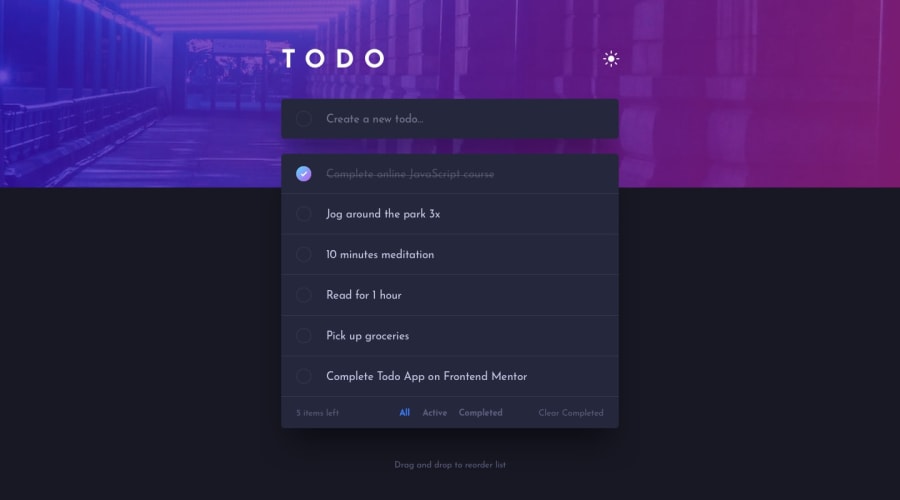
Design comparison
SolutionDesign
Community feedback
- @mohamed-montaser1Posted almost 2 years ago
amazing job @Biruk here the list of edits you can make to make the website more useful
- use local storage in window object to save the tasks when user refresh the page or quit it and return again will show the list of tasks
- on user click on complate on the left of task change the background circle to linear-gradient
- add transition to body and the header to make it smooth
example:
transition: all 0.3s ease-in;1
Please log in to post a comment
Log in with GitHubJoin our Discord community
Join thousands of Frontend Mentor community members taking the challenges, sharing resources, helping each other, and chatting about all things front-end!
Join our Discord
