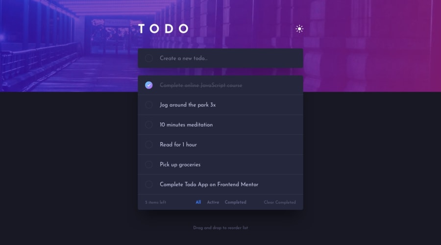
Design comparison
Solution retrospective
the most challenging part was designing a custom checkbox and I still can't figure out how to set a gradient color border for round checkbox I haven't implemented drag and drop but added one extra feature to edit to-dos. I am having issues in implementing drag and drop so working on it. Feedback is welcomed.
Community feedback
- @dostonnabotovPosted over 2 years ago
Hi, there. That looks perfect! However, I found a little issue. When you cross out/complete task, the items remaining is not updating. And, everything looks great. Good luck!
Marked as helpful1 - @CallMe-ALPosted over 2 years ago
Looks good Kirty! Cool change from the main design of editing tasks. I recently completed the challenge, too. I included some links in my GitHub repo that helped me implement the drag-and-drop API in my own project you might find helpful!
If I could offer a couple suggestions, I'd add transitions to elements effected by the theme switch and increase the font-size a bit for the bottom buttons.
Nice work overall, keep it going!
Marked as helpful0@kirtymeenaPosted over 2 years ago@CallMe-AL thanks, Links were helpful will try to implement drag n drop.
1
Please log in to post a comment
Log in with GitHubJoin our Discord community
Join thousands of Frontend Mentor community members taking the challenges, sharing resources, helping each other, and chatting about all things front-end!
Join our Discord
